This is my animation which accompanies my Final Major Project. I created it using Flash, which is compatible with Illustrator files - so it suits my work better than After Effects (which is better with Photoshop files). It was my first time using the software, so it took quite a long time to do - but I really enjoyed the process.
As the theme of the animation project was transformation I decided to have my animals merging in and out of each other. This meant matching up all the right pieces and then adding a 'shape tween' to make them transform from one shape to the other. This had to be done with each individual piece and then 'shape hints' had to be added to guide the transformation. As I was new to the process it took a long time to do - I was in every Tuesday for the entire length of the project, trying to make it work best I could. There are still little details I would change to neaten the shapes and transformations up, but as a first try I'm pretty proud of it!
As my Final Major Project is inspired by a Finnish fairytale, I chose a beautiful Scandinavian folk song to accompany the animation. I also thought the music fitted the gentle transformations of the elements.
In the future I really want to do more animations - they don't all have to be as long as this, just some small ones of individual pieces would be really nice. I'm probably going to buy Flash when my bursary comes through, might as well make the most of being a student while I still can!
Wednesday, 9 May 2012

Sunday, 6 May 2012
Portfolio Visit - Paul Rose at Rapport Events

My third portfolio visit this semester was at Rapport, an ideas led events agency right here in Manchester. I'd heard about them from Chloe and Lisa who had previously visited them, so I dropped senior designer Paul Rose a line to see if he'd see me too! Luckily he got back to me and we arranged a time to meet.
I arrived in good time at their offices which are located in the Northern Quarter. The building they're housed looked pretty normal from the outside but it's really amazing inside. You walk into this 'indoor courtyard' with windows either side. Almost all of the windows had flower boxes on and there was lots of other plants which made it look so nice! Anyway, I went up to this little circular desk and the man behind it told me to get the lift up to where Rapport where.
As I said, I was quite early but there wasn't really anywhere else to go so I had to go in - better to be early than late I guess! Paul didn't mind that I was early though, he offered me a drink and said I could sit on this sofa until he was free. He was expecting an important phone call so I waited until that had been dealt with. It was a typical sort of Northern Quarter studio - a converted warehouse, with floorboards, big windows and cool artwork on the walls.
When Paul was finished we went into a meeting room and sat down. Paul told me Chris Platt (the Creative Director) might pop in when he had finished with some work but we could start without him. We had a brief chat about what I was doing at Uni and what I wanted to do afterwards. He was interested to know that I didn't just want to do editorials - I far more enjoyed 'physical' things, like installations and pattern design for products.
The first thing in my portfolio is the James and the Giant Peach book cover, which is very bold and colourful. I'm always slightly worried that people won't like that piece, as it doesn't bode well for the rest of the portfolio! Paul really loved it though and was impressed with my use of colour. He said that they usually steer clear of using too much colour as it can look quite chaotic but I had handled it well and it didn't look over the top. He loved the concept of the piece and agreed that it was wise to not just illustrate a peach. He said he could easily see me illustrating a whole series of Roald Dahl books using this layout - which is something I definitely want to do one day.
Next up was 8x8 and, again, Paul loved it! He liked the concept, the colours, the composition and said the black background really helped to not only make the colours stand out but to also 'soften' the piece. He was also really enthusiastic about the spot illustration and liked the fact I'd had it photographed in context as you could see how well it sat on the page of the book.
When we came to the Japanese book covers he once again said I used colour really well. The simple colour palette suited the subject matter and was well used across the two covers. He said that it was nice to see that I could use colour in different ways - wasn't bright and crazy all the time. He also said the figures in these pieces were really good and tied in well with the rest of my illustrations.
The Wellspring building is different to the rest of my portfolio as it is in black and white, but Chris said this was really good as it shows my 'adaptability'. He loved the arrangement of the elements and when looking at the photograph said the building sat really well on the page. The use of negative space around the shape made it look professional and draws your attention straight away.
At this point Chris came in so I went back to the beginning of the portfolio so he could catch up. He liked everything as well and it was so nice to hear Paul pointing out things that he liked to Chris!
We then got up to the Music piece and they were both really interested to hear about the project. They were also impressed to hear that my piece was the first to be chosen. Paul started to say it would be nice to see some photos of the final thing when I turned the page and there they were! They were both really enthusiastic about the installation and it was at this point that Chris said he'd love for me to do something similar for them! I was so happy to hear this as the Music project was so much fun so I'd love to do something like it again. At this point Chris had to leave but he said he'd write me a brief in the near future.
After this me and Paul talked for a little while longer and he said to keep emailing Chris until he wrote me a brief as he might be quite busy - but he'd get round to it one day. Paul asked me to keep in touch and send him new work when I do it, which I will definitely do.
Overall this was one of the best portfolio visits I've had - Chris and Paul seemed to love everything and they gave me some good advice on how to improve some bits of my portfolio. It really boosted my confidence and the thought that I might have a commission when I leave Uni has made me so happy! Thanks guys!
Friday, 4 May 2012
Big Illustration Party Time podcast - episode 8
We were advised to listen to a podcast entitled Big Illustration Party Time which is hosted by Kevin Cross and Joshua Kemble. This particular episode was about promotion, emailing clients etc. The two guys are both cartoon illustrators and sound like really fun, down to earth people. I was sceptical about having to listen to the podcast but I actually found it pretty useful.
They started of by saying that you shouldn't cold call art directors to ask for work. More often than not they will be too busy and don't like to feel pressured over the phone. An email is a much better way of contacting such people as they can decide to contact you in their own time. Basically an email is a lot less intrusive. I have recently proven this theory when I tried to get in contact with Rapport events. I emailed Paul Rose initially and he got back to me but asked me to contact him the following week as he was pretty busy. I emailed him the next week but didn't hear anything so tried phoning. I got the impression the guy on the other end was not exactly receptionist and didn't have much time to spare. I left a message but didn't hear anything back so emailed again. This time I did get a response and arranged a meeting. Paul asked me to ring and confirm our appointment on the day but when I did speak to him he seemed to be in the middle of something and I immediately felt back. Having said all that when I met him face to face he couldn't have been nicer! This just proves that art directors like to decide when they speak to other people and they can take time over an email.
Anyway back to the podcast, the guys suggested that a mailing list was a great way of keeping in touch with all of your contacts. You have to make sure you include the option for someone to remove themselves from the list but it's a nice 'reminder' to someone that you still exist. Art directors are generally a fan of this idea as, again, it's less intrusive. They suggested sending a mail-out every three months or so - any more could seem too much and this way you can build up your work in-between. They also said not to send an attachment as this can clog up the inbox and put people off responding to you. In the mail-out you should have an interesting font and make it short and sweet - people don't want to know your life history!
Another idea is to send holiday cards (this is the only exception to attachments according to Kevin and Joshua) - but only if there good. They suggested setting yourself a challenge such as illustrating a Christmas card without using green or red.
After you have done a job they said it's always good to send an email thanking the person for the work. You should always be appreciative and it will make people more inclined to give you more work.
Kevin and Joshua also said not to bother emailing people who don't get back to you, they'll just block you and slate your name to others so it's not worth it.
A great tip they gave was to go to book/magazine shops and find out the names of art directors from there.Once you've got their name you can search for an email address online. If you can't find an address, companies usually have the same format so if you can find one from that particular company you can have a good guess at the others.
Next the guys moved onto to social netwrking. Neither of them particularly liked the idea of using sites such as DeviantArt for finding clients - they're more for networking with other designers. Flickr is quite good though as there are lots of art director groups that could be useful. It's also another way of keeping in touch with other designers' or former classmates' work.
A final point they made was to keep in touch with teachers and classmates from Uni, you never know what you could do for each other. A job could come along that wasn't right for you but you could pass it along to someone else and hopefully they'd do the same for you in the future.
They started of by saying that you shouldn't cold call art directors to ask for work. More often than not they will be too busy and don't like to feel pressured over the phone. An email is a much better way of contacting such people as they can decide to contact you in their own time. Basically an email is a lot less intrusive. I have recently proven this theory when I tried to get in contact with Rapport events. I emailed Paul Rose initially and he got back to me but asked me to contact him the following week as he was pretty busy. I emailed him the next week but didn't hear anything so tried phoning. I got the impression the guy on the other end was not exactly receptionist and didn't have much time to spare. I left a message but didn't hear anything back so emailed again. This time I did get a response and arranged a meeting. Paul asked me to ring and confirm our appointment on the day but when I did speak to him he seemed to be in the middle of something and I immediately felt back. Having said all that when I met him face to face he couldn't have been nicer! This just proves that art directors like to decide when they speak to other people and they can take time over an email.
Anyway back to the podcast, the guys suggested that a mailing list was a great way of keeping in touch with all of your contacts. You have to make sure you include the option for someone to remove themselves from the list but it's a nice 'reminder' to someone that you still exist. Art directors are generally a fan of this idea as, again, it's less intrusive. They suggested sending a mail-out every three months or so - any more could seem too much and this way you can build up your work in-between. They also said not to send an attachment as this can clog up the inbox and put people off responding to you. In the mail-out you should have an interesting font and make it short and sweet - people don't want to know your life history!
Another idea is to send holiday cards (this is the only exception to attachments according to Kevin and Joshua) - but only if there good. They suggested setting yourself a challenge such as illustrating a Christmas card without using green or red.
After you have done a job they said it's always good to send an email thanking the person for the work. You should always be appreciative and it will make people more inclined to give you more work.
Kevin and Joshua also said not to bother emailing people who don't get back to you, they'll just block you and slate your name to others so it's not worth it.
A great tip they gave was to go to book/magazine shops and find out the names of art directors from there.Once you've got their name you can search for an email address online. If you can't find an address, companies usually have the same format so if you can find one from that particular company you can have a good guess at the others.
Next the guys moved onto to social netwrking. Neither of them particularly liked the idea of using sites such as DeviantArt for finding clients - they're more for networking with other designers. Flickr is quite good though as there are lots of art director groups that could be useful. It's also another way of keeping in touch with other designers' or former classmates' work.
A final point they made was to keep in touch with teachers and classmates from Uni, you never know what you could do for each other. A job could come along that wasn't right for you but you could pass it along to someone else and hopefully they'd do the same for you in the future.
Tuesday, 1 May 2012
Pick Me Up
During my trip to London I visited Pick Me Up at Somerset House. It's an annual event for graphic artists which showcases the best work in the Uk and from around the world. There was lots going on, with a variety of stands and stalls for graphic designers, artists and illustrators alike.
In the first section there was an exhibition entitled 'Pick Me Up Selects'. This was a collection of 20 international up and coming illustrators and graphic artists who had all been selected to take part by a panel of 'distinguished' judges. The work represented a variety of styles, methods and techniques. All the work was completely different, from paper sculptures to watercolours. All of the designs on display were available to purchase, not that I could afford any!
One of my favourite stands was right at the beginning of the exhibition. Lucie Thomas and Thibault Zimmermann teamed together to form 'Zim and Zou', a French studio based in Nancy. A lot of the work featured on their stand were paper sculptures in the form of a variety of objects. One particularly project on display was called 'Back to Basics' and featured a camera, telephone, polaroid camera and cassette player - all crafted from paper and card. The colours were what initially drew me to them - I loved the palette of blues, reds and greens with a smaller hints of an array of colours thrown into the mix. Then, when you look closely, you appreciate the incredible craftsmanship of the pieces. The time and effort that must have gone into making a single piece is mind boggling!


In the first section there was an exhibition entitled 'Pick Me Up Selects'. This was a collection of 20 international up and coming illustrators and graphic artists who had all been selected to take part by a panel of 'distinguished' judges. The work represented a variety of styles, methods and techniques. All the work was completely different, from paper sculptures to watercolours. All of the designs on display were available to purchase, not that I could afford any!
One of my favourite stands was right at the beginning of the exhibition. Lucie Thomas and Thibault Zimmermann teamed together to form 'Zim and Zou', a French studio based in Nancy. A lot of the work featured on their stand were paper sculptures in the form of a variety of objects. One particularly project on display was called 'Back to Basics' and featured a camera, telephone, polaroid camera and cassette player - all crafted from paper and card. The colours were what initially drew me to them - I loved the palette of blues, reds and greens with a smaller hints of an array of colours thrown into the mix. Then, when you look closely, you appreciate the incredible craftsmanship of the pieces. The time and effort that must have gone into making a single piece is mind boggling!


Another designer who used colour beautifully was Mimi Leung. Although her work is not usually the sort of thing I am drawn to - the vibrant colours of her pieces immediately caught my eye. I also discovered that she often acts out the movements she is trying to capture in her drawings. You can tell she does this as her art was extremely fluid and expressive. I loved the quirky characters she has illustrated, there's a great sense of fun about them.


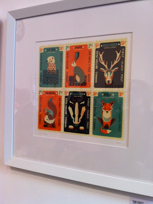
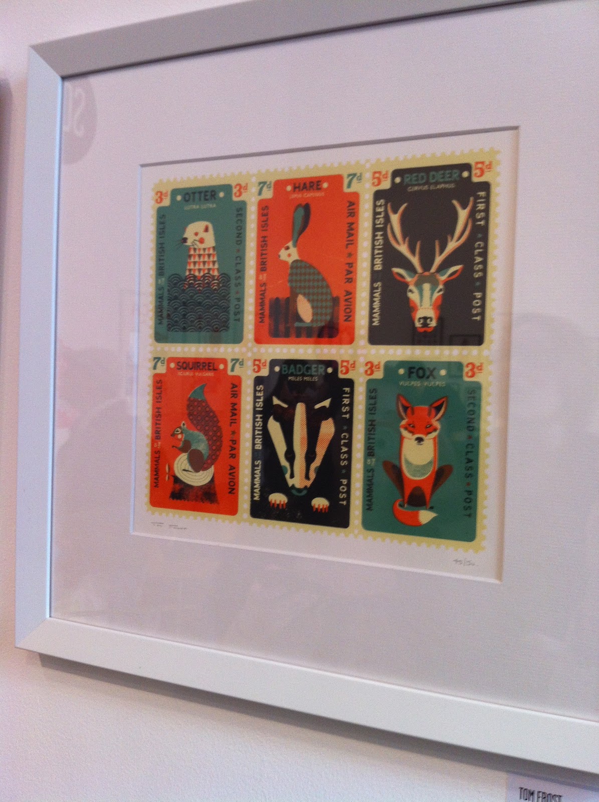
On another floor at were a collection of studios and agencies that had each brought a selection of artists, illustrators and designers' work. One that I really liked was Tom Frost who was with 'Soma'. He had a gorgeous collection of prints on display which included a group of animal stamps. The frame with an otter, rabbit, deer, squirrel, badger and fox was my favourite. The outline of the stamp and the simple patterns and shapes on the animals really made the piece stand out in my mind. I love the symmetry of the illustrations and also the muted colour tone - it really lends itself well to the subject matter.

Overall Pick Me Up was a great event and it was so inspiring to walk round and be surrounded by all that amazing work. I'd love to go back next year when I had more time to look at everything properly! I love the fact it was designers and illustrators under one roof, there was such a multitude of styles which made it really interesting and quirky.
Saturday, 28 April 2012
Portfolio Visit - Aurea Carpenter at Short Books

My second portfolio visit in London was with Aurea Carpenter, co-founder of Short Books, a book publishing company. Prior to the trip I'd scoured the internet for possible visits and Short Books caught my eye firstly because of its lovely website! I then noticed that in the contact section there was a small note saying illustrators were welcome to send their work in. This was an encouraging sign that they might be willing to see me so I went ahead and emailed them. I requested a visit for myself, Becca and Chloe and sent them a links to all our websites. A lovely lady called Clemmy got back to me and said her colleague Aurea would be happy to see us!
As it happens, our hotel was within walking distance of the Short Books office. It was a lovely day and it was nice to walk rather than get the tube and have a look at the area. The actual building was just off a cute little square with lots of shops and cafes - we all agreed that we preferred this quieter area to the busy centre of London!
Short Books is located in a shared building so we had to walk up to the right floor - we were all quite hot at this point, a mixture of nerves and heat I think! Once we had found the right place we were shown through to where Aurea was. If I'm not mistaken, Short Books are in a partnership with another publisher called Profile Books. I think it was these offices that we had to walk through before reaching Short Books. Anyway, all the offices were lovely - it had a mixture of old and modern, with creaky floorboards and glass rooms. There were books everywhere (as you would expect) which made it feel quite homely and cosy. When we reached the Short Books 'section', we were met by Aurea and led through to a glass walled meeting room. We all sat down and as Becca was closest, Aurea began with her. I wasn't too bad when we arrived but as Becca was going through her portfolio I was getting more and more nervous! When it was my turn I could feel myself shaking, but I tried to keep my cool! It perhaps helped that the first piece in my portfolio was a book cover (James and the Giant Peach) so she was immediately interested. She liked the concept and the colours a lot, saying it was very eye-catching - which is what a book needs to be when it is on a busy book shelf. She also liked how it was inspired by the 1960's and was very different to Quentin Blake's work.
Next up was 8x8 and Aurea was really interested to hear about the collaboration between us and Manchester Metropolitan Literature students. She was also shocked when we told her that our writer didn't really seem to like my work even though I got picked to illustrate her story! Again Aurea liked the colours in this piece and how the individual elements were linked so closely to the story.
When I showed her my Japanese book covers I was a bit nervous in case she didn't like them, but I needn't have worried as she said I coped very well with the characters. She also liked the muted colour palette and said it was appropriate to the subject matter.
In the rest of the portfolio, the other pieces she particularly liked where the Russian page from the Zine book and Wellspring building. She also said I had a strong style that carried through the portfolio and everything was nicely presented.
Aurea took her time looking at all our portfolios which was really nice. I thought as it was a group visit, she might not spend as much time with each of us - but she did! She then took us all through to the main office and showed us a book cover that she is commissioning at the moment. Several drafts had been sent in by the illustrator and she was in the middle of putting the cover together. It was really interesting to hear the process that goes into making a book cover and we were amazed when she started asking our opinions on the piece. It was great that she was treating us 'equals' and valued what we thought.
Overall it was a great portfolio visit which we all really enjoyed. I think we were all pretty jealous of Aurea's life - working in those lovely offices, in a lovely part of London! Thanks Aurea for a great visit!
Portfolio Visit - Johann Chan at Digital Arts

My first portfolio visit in London was at Digital Arts magazine with Art Editor Johann Chan. After arriving at Euston train station I had about an hour to compose myself before the meeting - I was feeling pretty nervous at this point! The Digital Arts office was on busy Euston Road and was situated in quite an imposing building. After signing in and travelling up in the lift, I arrived at the Digital Arts floor. There was three doors and I had a mini panic attack as I wasn't sure which one to go in! However, after a quick peer through the small windows I managed to locate the right one. The lady on reception was lovely and made me feel more at ease. The offices were really amazing and had lots of meeting rooms, large desks and a funky waiting area. I only had to wait a couple of minutes before Johann arrived and greeted me very warmly. We went into a large meeting room which was quite scary, but I tried to keep my cool!
We started off with chatting about what I was in London for and I explained a bit about what I was doing in Uni. Johann then said that he gets loads of emails from students requesting portfolio visits but he doesn't always have the time to see them. But as my email was so polite and enthusiastic, he couldn't say no to me! I thought it was really nice of him to say that (plus the lecture that Stuart from Thoughtful gave on constructing emails was thoroughly worthwhile!).
We then went through my portfolio and as we were sat opposite each other, I was careful to face the book towards him (another tip from Stuart!). He liked my James and the Giant Peach book cover and was interested that I was shortlisted for the competition. He liked the typography and the fact that I had illustrated the lesser obvious characters. Next up was 8x8 and, like other visits, he seemed to like the spot illustration a bit more than the main one. Perhaps this is because it is more graphical and sits in its own shape, much like the Wellspring.
We then went through my portfolio and as we were sat opposite each other, I was careful to face the book towards him (another tip from Stuart!). He liked my James and the Giant Peach book cover and was interested that I was shortlisted for the competition. He liked the typography and the fact that I had illustrated the lesser obvious characters. Next up was 8x8 and, like other visits, he seemed to like the spot illustration a bit more than the main one. Perhaps this is because it is more graphical and sits in its own shape, much like the Wellspring.
In his initial reply to my email he had stated that he really liked my Wellspring image and again, when we reached it in the portfolio he commented on how he loved the arrangement of all the elements. He also liked the elements themselves and in particular the fact that he could see I'd hand drawn them first. It became apparent, as we went through the rest of the portfolio, that he liked the work where it was fairly obvious I'd hand drawn it first. This was really surprising as no one has ever mentioned this before. He was curious to know more about my working process and was quite interested when I told him I draw things out first in my sketchbook and then trace over it in Illustrator with the pen and shapes tool. Johann found this intriguing and said it was a different way of working - he liked it though, as many digital illustrators use Illustrator as their first port of call.
Everything in my portfolio has been drawn in my sketchbook first, but over time I've tried to develop a personal style. In my earlier work, such as James and the Giant Peach and Wellspring, the style is quite soft and is less graphical. Whereas I have tried to progress my style and move away from that sort of illustration, Johann liked it as he said he could see more personality. He said he didn't not like my other work, just that the 'hand drawn' pieces appealed to him more.
After finishing looking through my portfolio, we talked about what I wanted to do after University and the ways I could go about getting work. One particular piece of advice Johann gave stuck in my mind, as I thought it was really useful. He said that rather than contacting art directors with your 'normal' work, you could mock up an illustration to suit their needs. For example, if you wanted to get commissioned by a health magazine you could find a relevant health article, illustrate it, and send it to the art director. Johann said art directors, more often than not, don't have time to trawl through lots of illustrators, so if you present a piece of work they could easily see fitting into their publication, you're more likely to get a job. Of course, this would take a lot of time if you were to do it for every publication you wanted to work at - but for bigger clients, I think it's a really good idea.
At the end of the meeting Johann gave me a couple of Digital Arts magazines, which was awesome as they're £5.99 each and usually only available through subscription! I then gave him a business card a box chocolate biscuits to say thank you. He loved the gesture and said it would be sure to keep me in his mind. Sure enough, a little while later I saw that he had mentioned me on his Twitter feed. Love the picture of the chocolates and business card! Thanks Johann!

Everything in my portfolio has been drawn in my sketchbook first, but over time I've tried to develop a personal style. In my earlier work, such as James and the Giant Peach and Wellspring, the style is quite soft and is less graphical. Whereas I have tried to progress my style and move away from that sort of illustration, Johann liked it as he said he could see more personality. He said he didn't not like my other work, just that the 'hand drawn' pieces appealed to him more.
After finishing looking through my portfolio, we talked about what I wanted to do after University and the ways I could go about getting work. One particular piece of advice Johann gave stuck in my mind, as I thought it was really useful. He said that rather than contacting art directors with your 'normal' work, you could mock up an illustration to suit their needs. For example, if you wanted to get commissioned by a health magazine you could find a relevant health article, illustrate it, and send it to the art director. Johann said art directors, more often than not, don't have time to trawl through lots of illustrators, so if you present a piece of work they could easily see fitting into their publication, you're more likely to get a job. Of course, this would take a lot of time if you were to do it for every publication you wanted to work at - but for bigger clients, I think it's a really good idea.
At the end of the meeting Johann gave me a couple of Digital Arts magazines, which was awesome as they're £5.99 each and usually only available through subscription! I then gave him a business card a box chocolate biscuits to say thank you. He loved the gesture and said it would be sure to keep me in his mind. Sure enough, a little while later I saw that he had mentioned me on his Twitter feed. Love the picture of the chocolates and business card! Thanks Johann!
Friday, 27 April 2012
The Times visit
Whilst in London Becca, Chloe and myself went to The Times for a guided tour of News International by Jon Hill, the design editor. We tagged along with some graphics students for who the tour had been organised but Jon had said we were welcome to come.
The News International offices were really impressive, though not overly busy, as I would have expected. This was probably due to the lovely weather and the fact it was mid afternoon! Anyway, we were taken up to the first of two floors that The Times occupy and from here you could see right down the middle of the building. Jon pointed out which floors The Sun is on and also where The News of the World used to be (that floor was dark and empty which was pretty funny!).
We then walked around all the different departments such as sport, travel and world news. It was really interesting to see all the reporters working on their pieces and impressive how slick the 'machine' of The Times was. Everyone had huge computer screens which you could see the layout of the newspaper on and lots of research and past newspapers littered the desks. We also got to see the large offices of the editor and deputy editor which had the best view in the building overlooking the Thames.
As we were walking round Jon pointed out a little office that the in-house illustrator works in. Unfortunately she wasn't there, which was a shame, but it was nice to see how an illustrator fitted into the system of things. We did, however, see the in-house cartoonist working on his latest drawing. He had a much bigger office than the illustrator but this was to be expected as he is an established political artist that is well recognised.
We then came to the design section which was a lot bigger than I expected, it was larger than a few of the other departments. The designers all had big Macs (of course!) but didn't have much of a desk space - but I suppose the majority of work is done on the computer.
Jon also gave us a sneak peak at a special office designated to the Olympics. Here they have mocked up loads of articles and front covers which cover all eventualities. They had one for if Usain Bolt wins, if Chris Hoy loses and so forth! They also had lots of charts and diagrams which will go in the newspaper every day of the games - they're so prepared it's untrue!
At the end of the tour we had hoped Jon might take a look at our portfolios but unfortunately he had hinted he was really busy so we felt rude to ask. I think it would be more convenient for him if we emailed him and he'd probably be able to take more time over it. Despite that, it was a great tour which was extremely insightful. Working at a newspaper is not something I would choose to do (it looks too pressured and hectic) but it was great to see the professionals at work.
The News International offices were really impressive, though not overly busy, as I would have expected. This was probably due to the lovely weather and the fact it was mid afternoon! Anyway, we were taken up to the first of two floors that The Times occupy and from here you could see right down the middle of the building. Jon pointed out which floors The Sun is on and also where The News of the World used to be (that floor was dark and empty which was pretty funny!).
We then walked around all the different departments such as sport, travel and world news. It was really interesting to see all the reporters working on their pieces and impressive how slick the 'machine' of The Times was. Everyone had huge computer screens which you could see the layout of the newspaper on and lots of research and past newspapers littered the desks. We also got to see the large offices of the editor and deputy editor which had the best view in the building overlooking the Thames.
As we were walking round Jon pointed out a little office that the in-house illustrator works in. Unfortunately she wasn't there, which was a shame, but it was nice to see how an illustrator fitted into the system of things. We did, however, see the in-house cartoonist working on his latest drawing. He had a much bigger office than the illustrator but this was to be expected as he is an established political artist that is well recognised.
We then came to the design section which was a lot bigger than I expected, it was larger than a few of the other departments. The designers all had big Macs (of course!) but didn't have much of a desk space - but I suppose the majority of work is done on the computer.
Jon also gave us a sneak peak at a special office designated to the Olympics. Here they have mocked up loads of articles and front covers which cover all eventualities. They had one for if Usain Bolt wins, if Chris Hoy loses and so forth! They also had lots of charts and diagrams which will go in the newspaper every day of the games - they're so prepared it's untrue!
At the end of the tour we had hoped Jon might take a look at our portfolios but unfortunately he had hinted he was really busy so we felt rude to ask. I think it would be more convenient for him if we emailed him and he'd probably be able to take more time over it. Despite that, it was a great tour which was extremely insightful. Working at a newspaper is not something I would choose to do (it looks too pressured and hectic) but it was great to see the professionals at work.
Subscribe to:
Posts (Atom)