Showing posts with label PDP. Show all posts

Wednesday, 11 May 2011

Folk article

Jo pointed me in the direction of this really interesting article from Creative Review titled 'The F-Word'. It looks at the current trend of folk style art in the illustration world and explores why it has become so popular.
There was one issue discussed that I found particularly intriguing - that illustrators have stopped thinking about what digital software could do for them and rather started thinking about how they can rewire it to suit their needs. I think this is a good point and somewhat relevant to my work. I have to make sure that I never let the digital technology become the driving force behind my work.
The article also discusses the reasons why folk art is suddenly everywhere we look, from fashion and home-wares to TV adverts. One theory is that larger brands may want to be associated with the organic feel of the artwork in order to appear more 'green'. However, I think it's only natural that everyone wants to jump on the folk bandwagon - it's on trend at the moment so everyone is going to want that look for their company.
One artist who is discussed in the article is Sanna Annukka, who has Finnish heritage and a love of Finnish landscapes and nature. "While advertisers may have cynical motivations for tapping into the folk trend, its foremost practitioners are referencing something that has personal significance." Annukka is proud of her background and Finland has always had a big influence in her work.
It was interesting to read that folk is considered a dirty work (hence the title), with no-one ever asking agencies for 'something folky'. Apparently 'homespun' and 'wholesome' are more commonly used!
"No doubt the trend wheel will turn again soon but for now, it's all about the folk."

(Sorry the scan of the article is so small, I couldn't get it to go any bigger when I loaded it on here!)


Tuesday, 10 May 2011

123

Simplify line and shape (Ian Murray)
I think Ian first talked to me about this during the 'James and the Giant Peach' project. I was considering doing a very busy design so he suggested making the elements as basic as possible. It was quite hard at first to simplify everything down but I was really pleased I did, otherwise the final piece would have been so hectic! I've carried this principle on whenever I've produced a busy design, such as the Wellspring and 8x8, and I think it works well. Next year I'd like to try combining this idea with making a more elaborate composition and see what happens!

Love and enjoy what you do
(Hannah Firmin)
This may seem obvious but I've realised how important it is to enjoy what you do. Sometimes I've been made to feel that because my work is created purely digitally, it doesn't have a 'soul' and looks too generic. I've often thought that maybe I should try adding textures and hand drawn elements to my work to make myself feel more like an illustrator. However, I've realised that I really enjoy working in the way that I do and I shouldn't feel bad about it. Two of my favourite illustrators at the moment, Patrick Hruby and Arlene Adams, both work purely with Adobe Illustrator and their work is doing really well. All that matters is that I enjoy what I do!

Do what you feel is right (Ian Murray)
I find it really difficult to decide if my ideas are working or what I've produced is good enough. I need reassurance that I'm going in the right direction and I really need to trust myself more. During the 'James and the Giant Peach' project I was changing my mind a lot and when I spoke to Ian he just said to do what felt right. In the 8x8 project I think I became a bit more confident and made decisions on my own. At the end of the day, I'm not going to be at uni forever and I need to learn to trust my judgement if I'm going to succeed.

Monday, 9 May 2011

Arlene Adams - Contact Report

So I got in touch with Arlene Adams to ask her a few questions and she got back to me! Here are her answers:

Looking at your website, your new work is very different to your previous work. What caused this change?
There were a couple of reasons for the change. I had a few years out of illustration when I had my little boy. I came back afresh wanting a change in direction and a desire to do something new. Also when you work in a style that is quite fashionable inevitably your work has to evolve.

What are your inspirations? Do any artists/designers inspire you?
I like Alexander Girard and a lot of mid century design. I collect a lot of mid century objects and books which have influenced my work recently.

You obviously love using colour, how do you know when enough is enough?
I think it is just an intuitive thing. Working digitally now has made it a lot easier to play around with different colour combinations.

Would you be able to tell me about your working process? How do you get started on a project?
A lot depends on the brief and how open it is. I may gather some reference material if needed (now a lot easier with the internet). I start with pencil sketches which I scan, then work in Illustrator.

Are you ever stuck for ideas? If so how do you overcome this?
It is not that I get stuck for ideas more that I find it difficult to decide on what idea to go with. I find it easier working to a brief as I am very indecisive and the options are more limited.

The elements in your pieces are often symmetrical and your designs in general seem to play with this idea, is this a conscious thing?
I think this is something that has evolved but comes quite naturally to me. I am quite an ordered person so perhaps this is reflected in my work!

Is there any advice you would give to an aspiring illustrator?
If you want to make a living from being an illustrator you have to find a balance in being true to yourself and doing work that is commercial - which isn't always easy!!! You often have to compromise to keep a client happy! It is not a 9-5 job - you will have quiet periods and (hopefully) hectic ones. 'By perseverance' which happens to be my old school motto!


Friday, 22 April 2011

I wish I'd done this


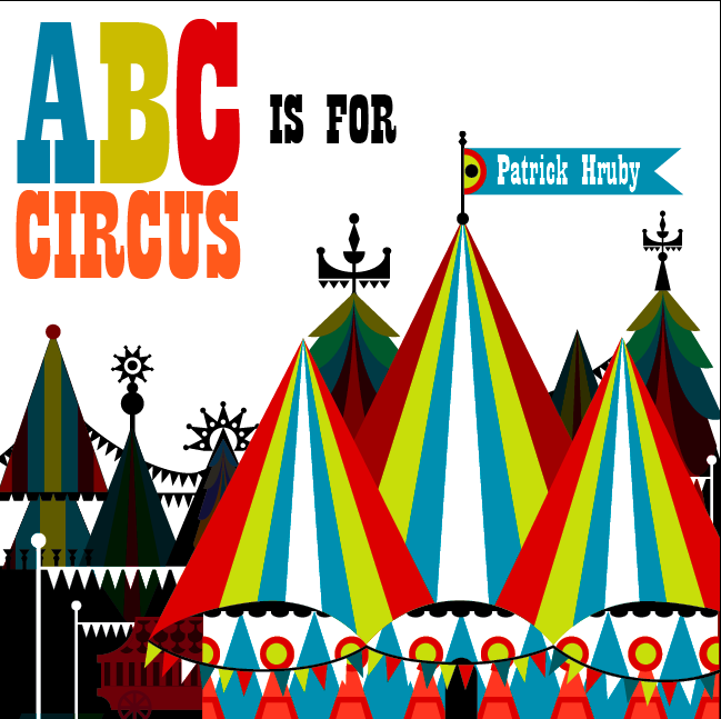
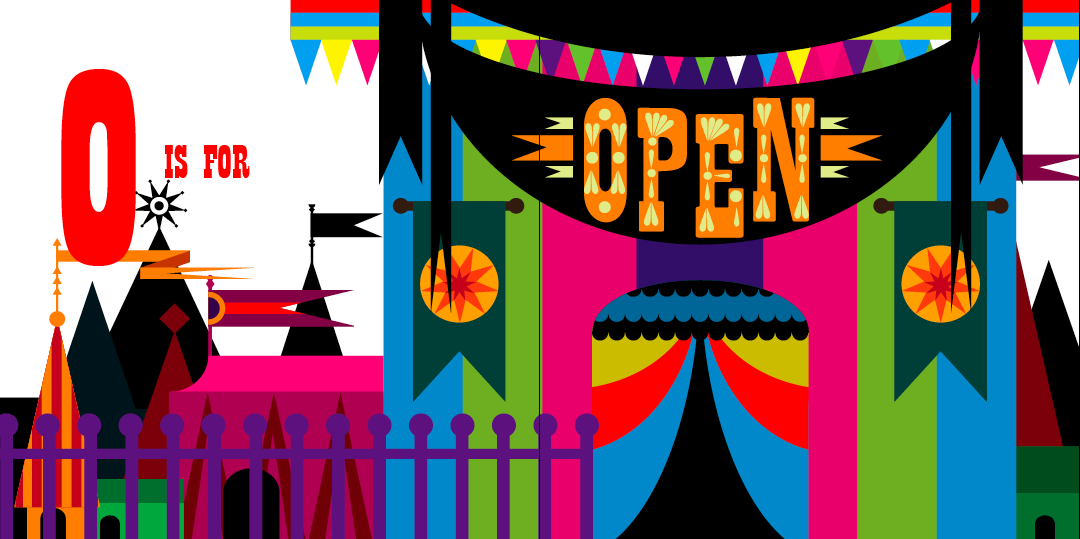
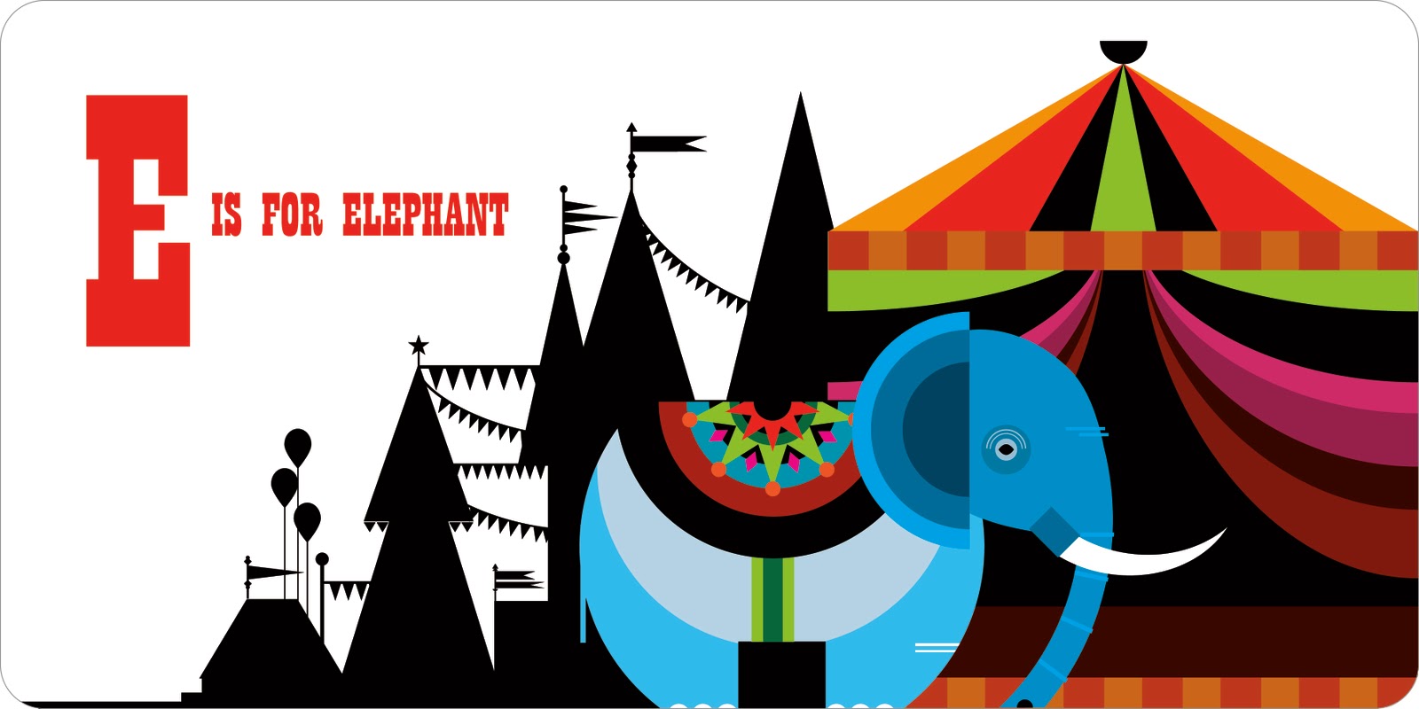
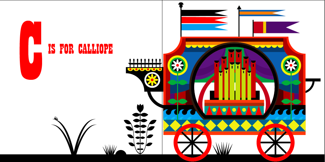
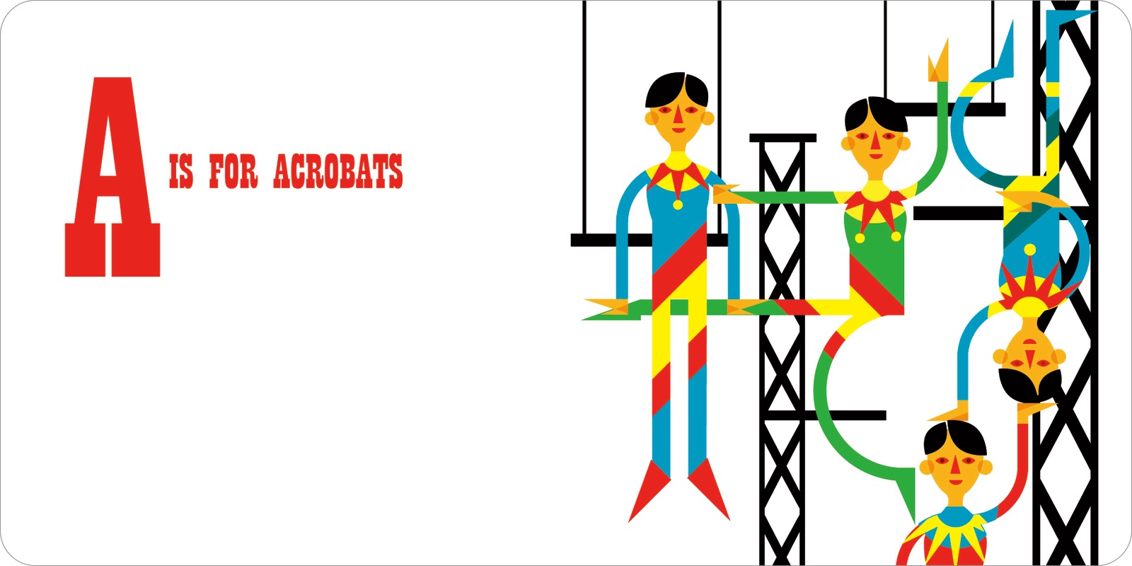
I know that we're only supposed to talk about one image, but I just love all of the illustrations Patrick Hruby created for the book 'ABC is for Circus'. The book celebrates the colourful and wonderful world of the circus through each letter of the alphabet. When I first saw it, I was mesmerised - it was so imaginative and beautiful. Each double page spread is completely different, with the composition of the pages changing each time.


The first thing that strikes you, in these images, is the colour. Patrick has a brilliant eye and although some of the images are packed full of different colours, it never looks too much. He knows exactly when to stop and which colours work best together. I also like how he adds black to a lot of the images - it makes the bright colours pop out of the page even more and adds a certain amount of depth to the pieces. Colour is very important to me and I am hugely influenced by Patrick's ability to control the colour in his illustrations. Although I have experimented with colour, I would really like to create a piece where all the colours are 'touching' each other and not separated by black - it would be interesting to see how I would cope with this technique.


Patrick produces most of his work on Illustrator which allows him to create a smooth line to compliment the bold shapes and colours. The circus designs include a lot of intricate shapes which are often layered over each other. Although I can use Illustrator fairly well, I think the next step in improving my work is to produce more complex designs. I love how Patrick uses lots of simple shapes but builds them up in such a way that the finished result is very elaborate. This technique is definitely something I could use in my own work, in order to add another level of interest.


Patrick likes to create his own fonts and I really like the one he's used for the circus book. It's fairly simple but I like this as it doesn't draw attention away from the main illustrations. I dabbled in creating a font when I did my James and the Giant Peach cover and I thought it worked rather well. In the future, I liked to try and create a font which combines my love of colour with shape. On his website, there's an example of Patrick doing this really well, by overlapping simple shapes to produce a really quirky font.


One of the things that I love most about this book are the background elements. On various pages, Patrick has created a black silhouette of a circus scene to use as a background. As said before, I think the black makes the bright colours of the main image stand out even more. It also adds another layer of interest and creates a sense of depth. One of the most successful images that uses this idea is the 'daredevil' page. I love the detail of the silhouette - he has obviously spent just as long on that as the foreground image. In future work, I'd really like to experiment with combining colour and pattern with black - I think Patrick's use of this idea is very striking.


The main reason I love Patrick's work is because of his use of shape. When you zoom into one of his pieces, you see a series of simple shapes - but he builds them up into intricate patterns that become figures and elements. I particularly love the 'acrobats' page in the circus book, it's so wonderful and quirky. Two of the figure's legs are almost perfect circles and all of their hands are created from triangles. The sharp edges of the graphic shapes really compliment the vibrant colours, all of which makes the finished designs really bold and eye-catching. It's such a clever technique and combined with his use of colour and pattern, really sets him apart from other illustrators today. I love how you can see a clear connection between all of Patrick's work, right through to his typography, where he also uses simple shapes.


Although you can view a lot of the Circus book online, I've ordered a copy for myself! In 'real-life' I think the images will be even more stunning than they are on the computer screen. Patrick's use of colour, shape and technique make him my favourite illustrator today and I can't wait until the book arrives!


Wednesday, 20 April 2011

Hannah Firmin - Contact Report

I emailed the lovely Hannah Firmin and asked her a few questions. She emailed back and gave some really good answers:

I understand you have recently moved to Wales, does living there have an impact on your work?
Living in Wales will influence me I'm sure, it's a bit early yet as I haven't had time to produce work for myself, I am selling well in local galleries and have been invited to exhibit during the Hay Festival in a few weeks time. I am always inspired by my surroundings....I lived in a village with a windmill above my house....see how many times you can spot a windmill in my work!

Where does your love of bright colours and patterns stem from?
I have always loved textiles, and sew and knit myself. Patterns and decoration in everyday life are very important to enrich our lives. Travelling the world shows you this too, I loved the fact that in Bali even the road sweepers wear beautiful sarongs and head dresses!

What are your inspirations? Do any artists/illustrators inspire you?
Some of the artists that have inspired me are Picasso, Bonnard, Thomas Bewick the engraver, Edward Bawden, Edward Ardizzone, John Piper, amongst many others!

Are you ever stuck for ideas? If so how do you overcome this?
Usually I have to work to a deadline so I can't ever be stuck. I will look at books and other people's work, go to an exhibition or just go out and do some drawing of I can't proceed.

Would you be able to tell me about your working process? How do you get started on a brief?
If I am doing a book jacket I always read the book until an image stands out. If it's something else I will usually have a size to work to which helps me with the general design. If the subject is new to me I will research and do some drawing before designing a composition. Once the rough has been approved I have to transfer it, in reverse, to my chosen block, lino, wood or vinyl. I cut it with the engraving tools, print and then when dry I cut up and collage and then finally paint. A long and elaborate process, which I love.

When did you get into printmaking, have you always used this process in your work?
I have done linocuts since a small child and etching at college, so almost all my life! It is always my chosen medium and I have become known for this way of working....my identity as an artist.

What did winning the Best Cover of the Year at the British Book Awards for the 'The No. 1 Ladies' Detective Agency' mean to you? Did it increase your profile?
Winning the award was great as it did increase awareness of my work and a lot of work developed from A.McCall Smith's popularity and his choice to continue using me for his covers. When you work freelance and at home there aren't many chances to gain recognition and acknowledgement for all one's hard work (I have worked as an illustrator since 1981!) so it was lovely to win (I wasn't invited to the award ceremony though!)

Is there any advice you would give to an aspiring illustrator?
My advice is to work in a medium you love and develop continually as, if you are intending on doing this for your life, you need to love and enjoy it! Aim at developing your individuality and skills personal to you.


Thursday, 3 March 2011

Patrick Hruby - Contact Report

I emailed the wonderful Patrick Hruby but I didn't really expect an answer as he's a very busy man! However....he replied! He was so lovely and gave me some really good answers. It made my day and I was astonished he wanted to look at my work! Anyway, here's his email:

Hello Philippa,

I am really touched that you would reach out to me. I would be happy to answer your questions.

I understand you are currently based in Los Angeles, does living there have an impact on your work?
Living in LA has definitely influenced my work. It is a land of perpetual summer. Ironically I prefer the winter, but there are definitely a lot of bright colors in this vibrant city, not to mention we have Disneyland (my parents used to take me every few years for my birthday.)

What are your inspirations? Do any artists/illustrators inspire you?
Strictly speaking my inspiration comes from the place where nature meets mathematics, but also I grew up on fairytales and I try to get to that place of wonder and magic. Idols of mine are Charley Harper, Alexander Girard, Mary Blair, and Kay Neilson.

Are you ever stuck for ideas? If so, how do you overcome this?
I get stuck for ideas all the time. But I have learned that a lot of times I am just afraid to try an idea that might seem crazy at first. I try not to edit myself in the beginning.

Would you be able to tell me about your working process? How do you get started on a brief?
Even though all of my work involves software (mostly Adobe Illustrator) I will start with a pencil. Sometimes I try to resolve the design before I resolve the concept. Sometimes the concept is revealed to me as I work out the general composition is strict geometry. When I get a brief I usually just take a bit of time to daydream and imagine what the finished project will look like. I think about colors and composition then I start brainstorming ideas. I make a lot of lists. I put them away and come back to them after I have had some time to see it with fresh eyes. I try not to resolve everything in the beginning so that there is still a little room for surprise.

What media do you use in your work?
Like I said before, all of my work (except my paintings) are somehow rooted in digital media. Depending on what the final outcome of the work will be, I will either deliver purely digital files, or I will silkscreen the designs into a physical object, scan it and send that.

Have you always loved using bright colours in your work?
I have always loved bright colors, but I wasn't always brave enough to use them. When I began my studies at Art Center College of Design I was painting watercolors which were much more ethereal. As I grew more confident in color and design my work began to become more and more direct.

I notice you have created several alphabets. Where does this love of typography stem from?
I have always loved typography. It was a bit of a mystery to me, and I am ashamed to say so, but I didn't take very many graphic design classes in school. I thought that type had so many rules that I just steered clear of it. Then one day I just decided to start making alphabets as best I could just to demystify it for me. That began a new love for me.

Is there any advice you would give to an aspiring illustrator?
The best advice I can give you is not to limit yourself by what you think an illustrator should or would do. Think of your work in every application you can imagine, don't be afraid to discover that you may be a completely different sort of artist that you imagined you would be. Above all, protect the quality of your work.

I hope that helped. I would love to see some of your work if you have a site or if you would like to send me some work.

Good luck in your studies!

Patrick


Tuesday, 15 February 2011

The Chase

Today we were given a presentation by Lise Brian and Mika Shephard from a design agency called The Chase. They came to Stockport primarily to talk the third years about their portfolios but very kindly agreed to talk to us as well. They gave us some excellent advice on approaching design agencies and how we should prepare our portfolios.

They had contacted several agencies for us and asked them what they look for in new designers; their responses were as follows:


- CIA (Central Illustration Agency) - look for originality, good communication skills and a positive professional attitude.


- Heart Agency - look for someone who is different from anything they've seen before.


- Lemonade Illustration Agency - treat illustration as a real business.


- Folio Illustration Agency - know what illustration the agency works with.


Lise also gave us her own advice on how to approach an agency:
- Make sure you spell the person's name right.
- Don't attach too many files in an email.
- Follow up with a call.
- Be nice to receptionists.
- Try not to be too nervous on an interview.
- Know something about where you're going.
- Be enthusiastic.
- No job? Ask about a brief.
- Turn up unannounced.
- Can you help with anything?

Finally they gave some advice on preparing your portfolio:
- Take work out you don't like.
- Have a good mix of work.
- Keep your folder spotless.
- Treat it like any other layout job.
- Seeing the original piece is lovely.
- Don't put foam board in your folder.
- How much time have you got?
- Given advice? Don't take it all to heart.
- Practice talking about your work.
- Start and finish with your strongest work.

Lise and Mika had some excellent tips and I found the presentation really useful. Some of the points were quite obvious but it's amazing how you can easily forget about them. When I graduate I will contact as many agencies as I can to try and get representation. They have access to major clients that you couldn't reach on your own and they will scout out work to fit your style - they're well worth the effort!

Sunday, 23 January 2011

Graduates

On Tuesday, six previous Stockport college students came to talk to us about what they had been up to since graduating. I spoke to Rose Lloyd, Chris Madden and Natalie Wood; all of whom were really open and honest about their work. They had some great advice to offer and talked us through the work they had produced. Something they all advised was to approach companies yourself and not just sit at home and wait for the work to come to you. Working as a freelance illustrator is a hard profession and you need to get yourself out there in order to achieve success. Rose Lloyd stated it is useful to build relationships up with art directors as they may choose to use your work more than once. She said it is vital to meet deadlines; your reputation could be quickly ruined if you fail to meet the completion date. Rose also said that an increasing number of people have bought prints of her illustrations. This new venture may provide a more steady income as companies choose to cut their illustration budgets.
All the graduates said the hardest parts of working as a freelance illustrator was the tight deadlines and not knowing where the next paycheque was coming from. Chris Madden advised to send work to multiple design agencies. Although they take a cut of your payment, they have access to prolific companies which otherwise might be unreachable on your own. He is represented by Eye Candy illustration agency which have provided him with a number of jobs.
Although I would like to do editorial illustration, my passion is pattern and this may be more suited to the increasingly popular market of prints, cards and stationary etc. We'll see what the future holds!!

Chris Madden


Natalie Wood


Rose Lloyd


Sunday, 19 December 2010

Riitta Ikonen

On the 7th December we had a talk from a lovely artist called Riitta Ikonen. She is originally from Finland but now works in London. Her work is concerned with the performance of images, through photography and costume design. She makes weirdly wonderful costumes which often have quite a theatrical look to them. Riitta is often excited by small insignificant objects, which she transforms into costumes and photographs in seemingly normal locations. This combination of bizarre and ordinary is what makes her work so different - she creates new experiences for people to discover. Riitta is very inspired by nature and several of her outfits, such as the snowflake, explore this theme in a very unique way.
Since graduating from the Royal College of Art Riitta has been very successful and was recently involved in designing a series of landscape features for the 2012 Olympic park. She is also collaborating with a New York artist called Ian Wright, producing diverse pieces that combine photography, costume and sculpture.She also gave some great tips such as: speak to everyone and anyone and always be passionate about what you do. Riitta was really wonderful to listen to and even though her work wasn't entirely to my taste, it was obvious she is extremely passionate about what she does.


Friday, 3 December 2010

Dominic Wilcox

On Friday 26th November we had a talk from Dominic Wilcox, an artist, designer and inventor! The talk was really good and Dominic was very funny! He has a great imagination, I don't know how he comes up with some of his ideas. His work gives everyday things a new perspective and he creates some really mad but useful objects. I was blown away by his 'speed creating' where he created a new thing each day for 30 days. It's something I could never do, I'm not fast enough and would spend too long planning! I particularly liked his shadow drawing, mirror image and pencil shelf. The outcomes are very beautiful and they're all such simple ideas, which makes them even better!


I also loved his cute drawings for mad little ideas! Some of them were crazy but all were useful or believable in some way. You could easily see some of them being made and used. I love the style of his drawing, they are very innocent and simple. He has a very wry sense of humour and wit plays a huge part in his work. Here's a selection of some of my favourite drawings:


The workshop he gave in the afternoon was also really good. His suggestions were so good and so annoyingly obvious! He pointed out things we couldn't seem to see, and helped us to broaden our minds. By identifying little irritations, you can produce a whole host of ideas. He was really easy to talk to and definitely very helpful as far as the new project is concerned.