Showing posts with label My Work. Show all posts

Sunday, 10 July 2011

'Music' Project

In April we were given a live brief which had come from a design agency in Manchester called Music. The have a meeting room in their studio which is encased in glass and they invited students to put together a proposal for a design to cover the glass.
The brief they wrote is as follows: Create and install an illustrated interpretation of a music track of your choice to adorn a series of connecting glass panels to create an installation at the studio of Music.
The song I chose to illustrate was 'Lucy in the Sky with Diamonds' by The Beatles. I'd wanted to choose a song from the 60s as I love the whole flower power/psychedelic idea. In my work I love to use colour and when I listened to this song I imagined a bright, happy and crazy world. It's a really descriptive song full of lots of quirky elements and has a dreamlike feel to it so I thought it would fit hand in hand with my illustration style. Here's the lyrics if you want a looksee:

Picture yourself in a boat on a river,
With tangerine trees and marmalade skies.
Somebody calls you, you answer quite slowly,
A girl with kaleidoscope eyes.

Cellophane flowers of yellow and green,
Towering over your head.
Look for the girl with the sun in her eyes,
And she's gone.

{CHORUS}
Lucy in the sky with diamonds,
Ah... Ah...

Follow her down to a bridge by a fountain,
Where rocking horse people eat marshmallow pies.
Everyone smiles as you drift past the flowers,
That grow so incredibly high.

Newspaper taxis appear on the shore,
Waiting to take you away.
Climb in the back with your head in the clouds,
And you're gone.

{CHORUS}

Picture yourself on a train in a station,
With plasticine porters with looking glass ties.
Suddenly someone is there at the turnstile,
The girl with kaleidoscope eyes.

{CHORUS}

Right from the start I wanted to create a strip of patterned elements across the glass. I had recently completed the Wellspring project where I had arranged lots of elements together in a jigsaw style. I wanted to continue this ides by creating a playful mural that was fairly simple but eye-catching.
Many of the images in my design feature in the song but I've also added some other elements that I imagined would feature in this weird world. There are also some smaller diamonds, flowers and stars drifting off in a dreamlike way to give balance to the piece.
I created the design with vinyl as I wanted the images to be very crisp and clean and the vinyl cutter allowed me this accuracy. Vinyl is also easy to remove and it doesn't mark glass. I simply had to create my design on Illustrator and I could transfer it to the vinyl cutter.


A few weeks later...

Ed and Craig (who were co-ordinating the project) from Music contacted me to say they really liked my design and invited me to the studio to meet them. When I went in they basically said they loved the design and as there wasn't anything they wanted to change with it, could I be the first person to install it. I was more than happy to do this so set about organising everything.
I had to order 5m rolls of vinyl from the website that supplies Uni as students aren't allowed more than 2m of vinyl (bit silly if you ask me!) I had eight colours in my design so I had to create 8 Illustrator files with each colour's pieces on. This took quite a while as everything had to be numbered to make it easier to put up. I then took the rolls into Uni to get it all cut - this was very slow and took up the entire day!
Last monday I went into Music to begin putting my design up. My sister Lucy came with me, which helped a lot - much easier with two pairs of hands! When we got to Music we were greeted my Ed and Craig and shown round the studio, which is over three floors. We then met Adam who deals with the production side of things. He had been experimenting with some samples of vinyl I'd sent in and showed me how to put the vinyl up with water. I'd never heard of this technique before and was just going to put it up with application tape, but I'm so glad Adam had discovered the water idea as it made things much easier! Firstly, you spray some water on the glass and onto the sticky side of the vinyl. You then place it on the glass and the water allows you to move the piece of vinyl all over the place until it's in the right position. Using a squeegee you then squeeze the water out from behind the vinyl and your left with a piece of bubble-free vinyl stuck to the glass! It took us about two and a half days to put the design up - quicker than I expected but once we got into the rhythm of things it was fairly straightforward.
Everyone at Music really liked the design and kept singing the song to match it to the images. All the staff were so lovely and welcoming and we even got taken out for lunch as a thank you! It was a great experience and I'm really grateful to Craig and Ed for the opportunity.


Penguin Design Awards

The last few weeks have been pretty busy and I haven't posted anything since we broke up for the holiday, oops! So here's what's being going on....
On the tuesday after we finished I discovered I'd been shortlisted for the Penguin Design Award. I was totally gobsmacked as close to 700 people entered the Puffin category so wasn't expecting much!
Subsequently, all the shortlisted entrants were invited to resubmit their designs following advice given by Anna Billson, the Puffin Art Director. I changed a number of things in my design included the characters, the spine and the blurb - the later two involved tying them in more with the overall design.
I also had to wrap my design around a book, complete a research board, put my design on a board and a CD and write a short synopsis. This was all then shipped off to London to be judged.
On 22nd June my mum and I went down to London for the presentation ceremony. The Penguin offices were on the Strand and were very snazzy! There was a great view of the Thames from the balcony so it was really nice.
Unfortunately I wasn't placed anywhere but we had great day anyway and the winner was very deserving - check out all the shortlisted and winners here.
Here's my final design, the flap in detail and some photos of the ceremony:


Saturday, 7 May 2011

8x8

For the past few weeks I've been working on a project entitled 8x8 which is a collaboration with creative writing students from Manchester Metropolitan University. Eight students have written a short story and we get the chance to do the accompanying illustrations, with all the work being featured in a book and sold at the Didsbury Art Festival. However, only one illustration per story can be chosen to feature alongside the stories and there are two or three people working on each story!
The story I was assigned to is called 'Junctures' and is written by Anna Paldanius. The story revolves around a girl called Joy, who has a long time boyfriend called Frank. Joy cheats on Frank with a man called Jack, who she eventually falls in love with. Realising she loves two men she cannot choose who to be with and who to break up with. Eventually both men find out they have been lied to and leave her. Frank ends up killing herself and at his funeral Joy realises she loved him the most. At the end of the story, set a few years later, Jack runs into Joy and her young son. It is implied Jack or Frank are probably the father of the child but we are not told which one.
My foremost idea for the main illustration was a treasure chest with a lock in the shape of a heart. The lock has two keyholes representing that two men 'have the key' to her heart. I decided to build up a symmetrical pattern representing the two different men and the choice Joy has to make - one or the other. Surrounding the chest are various elements which symbolise the eight chapter headings in the story:
Despair - stormy sea
Joy - yellow flower
Love - heart
Innocence - acacia leaf
Decadence - bitten chocolate (self indulgence)
Anger - bull
Sorrow - teardrop
Happiness - sun
I also included playing cards to represent the chance and risk Joy is taking and arrows which suggest choice and different directions. For the spot illustration I took the elements I had already made and arranged them in the shape of a heart - I thought 'love' was the overriding theme in the story. However, I can't decide between putting yellow in the background or not...I think it ties the two pieces together but not sure if I need it or not?
I'm really pleased with the final outcomes, I think the main illustration in particular is very striking. I like the black background as it just adds a sense of darkness which the story has. The simple elements work well and I like the symmetrical look - it adds balance to the piece and gives it more of an impact as opposed to it being asymmetrical.


Thursday, 31 March 2011

Editorial Project

For the past two weeks I've been working on an editorial illustration for an article about parents not reading fairytales to their children. We had to choose an existing article to illustrate and this was where I encountered the biggest problem of the project! I found it really hard to choose an article - they're are millions of them all over the internet and I had real trouble narrowing it down. If I'm given something to work on, even if it's hard, I've got no option to change it so I just get on with it. But with this I kept wandering to articles that I liked but wouldn't particularly challenge me. I ended up choosing an article about fairytales and I wish I hadn't - I think I could have produced something much more interesting if I'd had a more difficult article.
Anywaaay...the illustration I produced is based on the idea that parents are shunning fairytales for less 'scary' stories such as The Very Hungry Caterpillar. In the image the caterpillar has become the scary one and is chasing off the fairytale characters. One of the challenges I faced was how to give well-known characters my own stamp. I created the image on Illustrator to give it a more modern look and I think it worked fairly well. The only character that perhaps doesn't work as well as the rest is Cinderella. Because of the Disney film, her look is so distinctive - so it was hard to make her my own.
I think the way I create figures has improved in this project, I particularly like Little Red Riding Hood and Hansel. The illustration sits well on the page and I like the strong purple in the background. I attempted to make the characters lift off the page by giving them shadows, but in subsequent work this could be pushed a lot further.
Overall I'm happy with the final design - I just wish I'd chosen a different article! (Sorry for the small images - not sure what's happening!)


Thursday, 10 March 2011

Wellspring Project

For the Wellspring brief, the page I was allocated was titled "what is wellspring?". In the text I had been provided with, there were a lot of elements included such as 'schools', 'churches', 'food', 'toiletries' and 'clothing'. In the last brief for James and the Giant Peach I created elements that had featured in the book to form a pattern. As I had really enjoyed creating the book cover I decided to do a similar sort of thing with this brief. I thought about what I could encase the elements in and came up with four ideas: a hand, a dove, the wellspring building shape and a tin of soup. When I showed the compositions to the client, Jonathan Billings, he really liked the one in the shape of the building so that's the one I went with.


I created the elements in a similar way to JATGP - I found references for each component and then copied the basic shape in my sketchbook. I tried to use a minimal amount of lines and shapes as otherwise it would become too busy once all the elements were arranged in a pattern. Once I had finished the drawings I scanned them into Illustrator and traced them using the pen tool. As I find it really difficult to work in black and white, I decided to fill them in with colour and greyscale them later. After talking to Ian, I then removed the black outlines from the elements - they ended up looking a little less complicated and not so harsh.


I then thought about the composition of the pattern itself. Although I had used rows for JATGP, Ian and myself thought it would be better for this brief to try something different. I had recently come across an illustrator called Nicola Meiring whose work often involves elements arranged in a jigsaw style pattern. I really liked the effect of this, so set about trying to fit my elements together in the shape of the Wellspring building. It was actually quite fun attempting to fit everything together, for some reason I like fiddly things!

I decided just to use the outline of the building and not try to include the inside shapes like the windows and doors as I thought this would look too complicated. After a tutorial, I also inverted the text across the top of the building so it was sitting inside a shape. I think this gives a cleaner finish and doesn't attract attention away from the pattern.


I think the main strength of my design is the composition of the pattern. I think I've managed to get all the elements to fit together really well and nothing stands out as being out of place. I also think the elements themselves are fairly successful. There are a few in particular that I really like such as the shoe and toothpaste. However, I think ones such as the comb could be slightly improved. I really enjoyed this project and will definitely use the techniques I learnt in subsequent work.

Friday, 11 February 2011

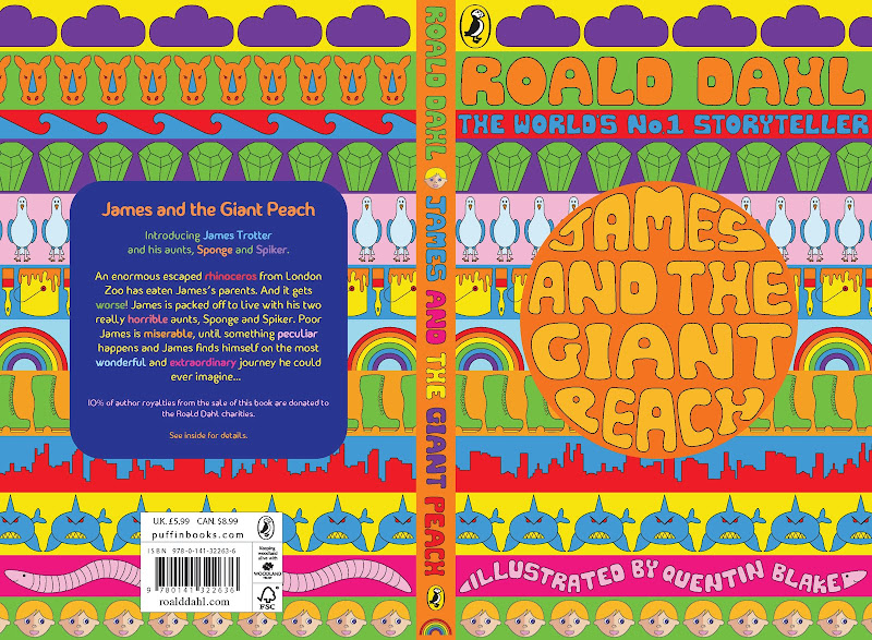
'James and the Giant Peach' book cover

For the past four weeks I have been working on creating a new book cover for the story of 'James and the Giant Peach'. We were given a selection of competition briefs to choose from, all from various publishers and organisations. I chose the Puffin competition as I had loved 'James and the Giant Peach' when I was younger and thought it was something I could really sink my teeth into!
Any Roald Dahl book is automatically associated with Quentin Blake and whilst I love his work it was a challenge to move away from his iconic illustrations. I wanted to do something completely different and inject my love of colour into the design. I had initially decided to have a large circle representing the peach sitting on top of a patterned background. I spoke to Ian about this and he suggested that rather than just having random shapes, why not use elements from the book to create the pattern. I really loved this idea so set about drawing different components from the book. Some had quite a major part to play in the story, like the seagulls, whilst others were less significant, like the rhino. I tried to make them as simple as possible to compensate for the colour overload and decided to use Illustrator to create a clean slick line.
Symmetry played an important role in the cover; all the elements were symmetrical when possible. Also, the circle on the front is balanced by a square of the same height and width on the back.
Regarding the typography, I opted to design a bubble-writing style type to highlight that this is primarily a children's book. For the back I chose a sans serif font that looked 'child friendly' but I would really like to make my own typeface for when I send it off to Puffin in April. I also wanted the text to be a part of the pattern not just an afterthought so incorporated it into the design, e.g. the worm is normal on the back but forms 'Quentin Blake' on the front.
When finishing the cover I decided to limit the palette to six colours, which were the basis of the rainbow. I added pink to the worm but other than that I didn't want to overload it with lots of colour.
Overall I'm really pleased with my cover, its everything I wanted it to be - colourful, eye-catching and unusual. There are a couple of things I need to tweak before I send it off but this is the version as it stands at the moment.


Sunday, 21 November 2010

Group Project

For the group project I was put in a team with 3 other members (Lisa from Illustration, Mike from Graphics and Luke from Moving Image). We were given the word 'kinetic' as a starting point and our thought process began by examining natural kinetics, in particular water based movement such as rain and tides. We liked how they are not controlled by ‘man’ and have quite a spontaneous nature to them. As a result of the water theme we decided to use inks, which are water based and have a fluid nature to them.

The concept of gravity also played a part in the project. The group thought it would be interesting to see how ink would fall when put on paper. It was very successful and because some drips fell further and quicker than others, it looked really quirky.

We also decided to experiment with throwing ink at a piece of paper. It produced a really nice effect; when different colours collided with each other they mixed and flowed in different directions. The group couldn’t decide between the drips and splatters so we concluded that we would experiment with both on the computer. In the end, we decided to combine the two as it created a more varied animation.

These are the two final pieces that we used in our animation:


This is our final animation/film:


Saturday, 18 September 2010

Las Meninas, Part 5

Just remembered that I haven't actually posted anything on the last swap of the summer project! So better late than never, here it is.....

Emma used a combination of elements to make her piece and I really like how they cohesively fit together in the composition. I especially liked her use of collage - it's very true to her style. This is her piece:


For my response I decided to take elements of Emma’s work and rework it in my own style. I liked the use of thread in her work so I used different coloured cottons to sew my image of the Lady onto paper. I tried to use colours similar to the original painting and attempted to spilt the line drawing up into sections so each important shape was clearly visible.

I was really inspired by Emma’s use of collage so I decided to create my own. I’ve hardly done any collage since foundation so I thought this would be a good chance to try it again. I really like using old magazines and newspapers to find imagery as I find they have so much more character. I also love the almost tea stained colour of the paper. I recreated the table and tea service and also added a candelabra and shoes which feature in the original painting.

Finally, I added a hanging birdcage which combined Emma’s use of birds and dotted lines. I was a bit worried that the image of the Lady was too faint alongside the collage elements, but I actually quite like it. It’s almost as though she’s fading into the distance after the curse has struck. This is my outcome:


I found it really useful to use Holly and Emma’s work as inspiration; after so long it was nice to see someone else's work. I found it helpful to see how they had responded to the painting and it gave me lots of new ideas to think about.


Wednesday, 8 September 2010

Las Meninas, Part 4

The first piece of work I received was Holly's response. She made a concertina book and used bits of the Tennyson poem as inspiration to collage from. I thought her piece was really good, I liked how it responded clearly to the painting and poem, whilst still being 'Holly'. This is her piece:


As I didn't particularly want to mess around with her work I decided to do what Emma had done and add another page onto the book. I decided to create a woven paper background, using similar tones to Holly's work. This time I used paper which was quite thin; meaning I could easily make sure it went together as tightly as possible. As both Holly and Emma had used lines from the poem I decided to incorporate the lines "there she weaves by day and night" and "she left the web, she left the loom". Both of these refer to weaving so I thought it was quite appropriate to use alongside my background. Finally I added a line drawing of the Lady onto the weaving. Initially, I was going to draw the outline onto the weave, but it ended up being barely visible among the lattice effect. So I then decided to fill the inside of the drawing white; to make it stand out more and add a bit of definition. This is my outcome:


I found it useful to use Holly's work as inspiration; after so long it was nice to see someone else's work. I found it useful to see how another person had responded to the painting and it gave me lots of new ideas to think about.

Monday, 6 September 2010

Las Meninas, Part 3

For my piece I decided to incorporate an image of the Lady with some sort of weaving. I did this to coincide with the idea that the Lady has to weave images of King Arthur's kingdom. However, I didn't use material to weave with, instead I used paper strips. In the first year one of our briefs was to manipulate paper, and this was where I first experimented with weaving paper. But this time I did it on a larger scale and took more time making sure the paper strips were all exactly the same size. As I was using quite a thick paper, I couldn't get the strips to get close enough together; so I had to leave gaps in-between. Since then I've used thinner paper and this works much better as you can get a tighter finished look.
For the Lady I used my line drawing of her and scanned in different textures and patterned papers to decorate each segment with. I also used patterns I have stored on my computer to create a more layered look. I tried to stay quite close to the colours of the original painting; just making them a bit more textured and brighter. I was really pleased with the result of this; as it's very me, whilst still staying true to the painting.
For the final design I scanned in my weave and adjusted the hue to a more pink tone. I also graduated the darkness to make it a bit more interesting and to focus the eye on the Lady. Finally, I scanned in some little paper coils I had made. This was to add a bit of movement to the piece as well representing the balls of wool on the painting.


Saturday, 4 September 2010

Las Meninas, Part 2

As the Lady of Shalott is quite a busy and complex painting, I started by thinking about how I could simplify it. As she is the main focal point of the piece, I decided to start with the Lady and see how that went. I wanted to get her down to her raw form and strip away all the textures and shading. So using a light box, I traced over the outlines of all the shapes I thought were important to her figure. I was really pleased with the result, as it almost looked quite Art Nouveau and I liked how it was so contrasting to all the busy elements in the painting.
I scanned this drawing into Photoshop and traced over it to get a more even and smooth line. I then began thinking back to all the beautiful colours I'd seen on my holiday in Spain. I had bought a little elephant figurine from Guadalest and I decided to use it as inspiration. I love all the blocks of colour and pattern painted onto it; it's so bright and eye-catching. I also think the black lines around the colours help to make them stand out a bit more. The idea of blocks of colour is also present in a mosaic lizard my sister bought. Using this idea, I looked at the painting and chose the main colours from the sections I had drawn.


I think the piece has turned out really well. Again, I like the simplicity of it and how it's more 'me'; with all the bright colours and black outlines. Also, if I take the black outlines away it creates a nice silhouette shape, which is interesting to experiment and work with.