Showing posts with label Research. Show all posts

Sunday, 30 October 2011

Fernando Volken Togni

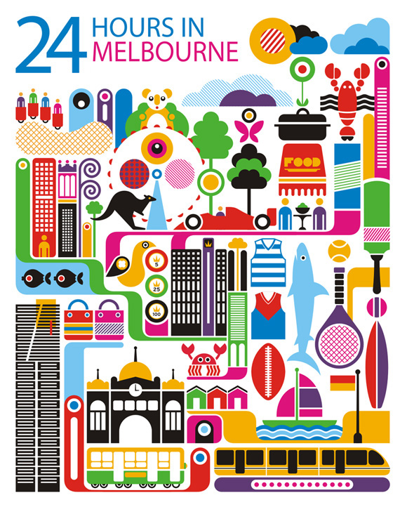
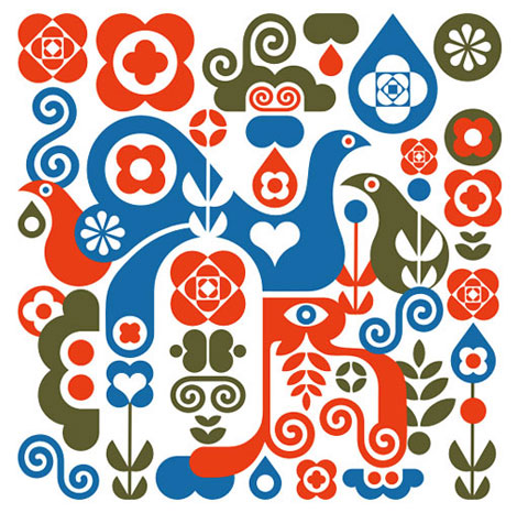
I discovered Fernando Volken Togni through the Creative Tourist website, which featured a Manchester cultural calendar with his work on. A Brazilian illustrator, Fernando creates amazing images that are full of bold, graphic shapes. His use of line is very simple but so effective, he can create beautifully intricate patterns. I love the folk edge to his work and his colour palettes are always perfect.


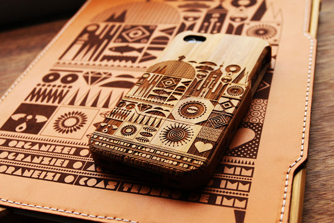
He's also part of a group of artists who Grove have teamed up with to design bamboo laser-engraved iphone and ipad cases. Matt Lyon, Kate McLelland and Jonny Wan have also been involved in the project and each artist has created their own case design and the results are stunning. There so expensive which is probably a good thing because I don't think I'd be able to decide which one to get!


Wednesday, 11 May 2011

Folk article

Jo pointed me in the direction of this really interesting article from Creative Review titled 'The F-Word'. It looks at the current trend of folk style art in the illustration world and explores why it has become so popular.
There was one issue discussed that I found particularly intriguing - that illustrators have stopped thinking about what digital software could do for them and rather started thinking about how they can rewire it to suit their needs. I think this is a good point and somewhat relevant to my work. I have to make sure that I never let the digital technology become the driving force behind my work.
The article also discusses the reasons why folk art is suddenly everywhere we look, from fashion and home-wares to TV adverts. One theory is that larger brands may want to be associated with the organic feel of the artwork in order to appear more 'green'. However, I think it's only natural that everyone wants to jump on the folk bandwagon - it's on trend at the moment so everyone is going to want that look for their company.
One artist who is discussed in the article is Sanna Annukka, who has Finnish heritage and a love of Finnish landscapes and nature. "While advertisers may have cynical motivations for tapping into the folk trend, its foremost practitioners are referencing something that has personal significance." Annukka is proud of her background and Finland has always had a big influence in her work.
It was interesting to read that folk is considered a dirty work (hence the title), with no-one ever asking agencies for 'something folky'. Apparently 'homespun' and 'wholesome' are more commonly used!
"No doubt the trend wheel will turn again soon but for now, it's all about the folk."

(Sorry the scan of the article is so small, I couldn't get it to go any bigger when I loaded it on here!)


Saturday, 16 April 2011

Maria Dahlgren

I went to Ikea last week and found these amazing postcards by a designer called Maria Dahlgren. The postcards feature five areas of Sweden and are very colourful and graphic in style. I love her use of lettering and the strong architectural angles are complimented by dazzling colours. There are so many different little elements and I really like the simplicity of the shapes and lines. Maria previously designed a tray and tea-towel which captured many of London's famous sites - her city designs have become very popular and fashionable. Recently, I am really liking Scandinavian art - I love the graphic yet patterned designs which can be inspired by a multitude of themes.


Monday, 11 April 2011

Jamie Brown

One of the briefs I'm working on at the moment is for a graphic design agency in Manchester called Music. Our task is to design a installation for a glass room in their studio. Ian gave us a presentation to give us some ideas for the project and one of the artists on it caught my eye straight away: Jamie Brown.
Jamie's illustrations are the sort of thing I envisage myself doing for this brief. His work is extremely bold and bright and full of different elements. I love the playful nature to his work - there are often little twists that you don't immediately notice. I really like how he uses fairly simple shapes to build up the image - this is something I will need to try and do if I'm going to use vinyl to create my design.
The song I've got in mind at the moment is "Lucy in the Sky with Diamonds' - which is a very psychedelic and has lots of brilliant imagery. In my head I see a really bold and colourful pattern covering the glass walls. I will definitely keep referring to Jamie's work to gain inspiration during this brief.


Saturday, 26 March 2011

Arlene Adams

I came across Arlene Adams on the Print and Pattern blog and immediately fell in love with her work. She uses Illustrator to create her designs and I really like how she used simple shapes to build up a detailed illustration. She uses colour really well and her work often has a Scandinavian feel. I also like her use of symmetry - which is something I have tried to do in my work. I think it gives the detailed designs a bit of balance and helps them sit better on the page. Looking at her website, Arlene's work appears to have changed drastically in style - for the better! I will definitely be keeping my eye on her to see what she does next.


Saturday, 26 February 2011

Merijn Hos

I came across Merijn whilst flicking through a blog I had come across and was instantly struck by one of his pieces. Although his style is not at all similar to mine and it's something I will probably never aspire to do - I couldn't help being amazed by it. I looked on his website and there is so much stuff on it! His work is really diverse and he experiments with lots of different media. On one page there is a beautiful watercolour, on the next a colourful collage and on the next a gigantic installation. But what really caught my eye were his series of China ink drawings. The detail in them is astounding and the content is so playful. I love the use of pattern and although they are black and white you can tell they would be bright and dazzling if they were in colour. They're so quirky and fascinating I just had to put them on here for you to see!


Thursday, 17 February 2011

Nicola Meiring

Following on from the presentation by The Chase, I had a look around the internet at some of the design agencies they had mentioned. I was having a mooch around Folio's website when I came across Nicole Meiring's page. She is originally from South Africa but recently moved to England. Her work is really amazing and certain elements really remind me of my own work at the moment. Nicole obviously uses Illustrator to create her pieces and they have a clean graphic feel to them. In several of her designs she has used elements built up in a pattern to form a shape; which is what I'm trying to do with this current brief! I love the style of her work - there are clear influences from Scandinavian design and she has a passion for iconography. She has a great sense of colour and works with an array of tones and shades. Nicole has worked for a wide variety of clients and she is in frequent demand. Her work is really inspirational to me so it may be that I'll contact her to find out more about how she works.


Tuesday, 25 January 2011

Ian Bilbey

Whilst talking about my James and the Giant Peach book cover, Ian recommended that I take a look at Ian Bilbey. He is a London based illustrator who concentrates heavily on line and colour. His work has quite a retro feel to it and can often be quite quirky. Ian said to look at how he creates characters and objects with pattern, rather than filling in a line drawing with colour. Looking through his portfolio, he seems to have a few different styles; which is quite unusual compared to other illustrators. However, it gives him a lot of flexibility and enables him to experiment with lots of different ideas rather than being tied down.
I particular like how he simplifies characters so not to make the composition too chaotic. For the brief I would like to combine the simplicity of his figures with the bright patterns of his objects. My favourite pieces of his work are those where he uses vivid colours and bold patterns, they're so eye-catching and vibrant - they make me feel very happy!!


Monday, 17 January 2011

Quentin Blake

When I went to London in December I also went to the Chris Beetles Gallery where they were exhibiting over 100 original drawings and watercolours by Quentin Blake. The exhibition was called 'Frabjous Beasts and Frumious Birds' and the room was crammed full of his amazing illustrations. What made it amazing was that Quentin was there to sign books and prints and I got to talk to him! It was really special as it was in such an intimate setting; a small gallery with barely 20 people milling around. Obviously only a few people knew about it, so I was really lucky to discover it was going on. I looked on Quentin's website and he sometimes does signings in big stores where hundreds of people turn up, so it was amazing to see him so personally. It was awe inspiring to talk to him so I was a bit excited and didn't really ask the questions I'd wanted to! However, he was really nice and signed my favourite book with his illustrations in, 'Fantastic Mr Fox'.
The prints on display were amazing and I'd never seen half of them so it was a real pleasure to see them so close up. I love his casual yet descriptive style, he can convey emotions and subtly communicate an idea with only a few rough lines. Quentin works with an ink pen and then uses watercolours to add colour. I like how it doesn't matter if the colour doesn't stay in the lines, it gives the drawings a sense of excitement and movement. Blake’s unusual figurative style and distinct scribbly, yet precise, lines make him one of my favourite ever illustrators.


Saturday, 15 January 2011

Oliver Jeffers

When I went to London in December I visited the Chris Beetles art gallery to see Quentin Blake's exhibition. Whilst there I looked at another exhibition that was on; 'The Illustrators - The British Art of Illustration'. One person who really caught my eye was Oliver Jeffers. The pictures on display were from a book of his called 'Up and Down' and featuring a little boy and his penguin friend. The illustrations were so beautifully done and the story was so sweet. Following the exhibition I found his website and looked through his other work. The painterly quality to his illustrations is not something I would necessarily do myself but I really enjoyed them. The characters have a lot of personality despite being very simply drawn and I can see that they would be extremely popular with children. I also love the fact that as well as illustrating he writes the stories. He has complete control over the entire process which must be a nice change from illustrating other people's ideas! At the exhibition his work was selling for over a thousand pounds each and I can see why; each one is a beautiful piece of art.


Monday, 10 January 2011

Anthony Burrill

I came across Anthony in a book of artist's prints in the interiors shop Habitat. What really struck me about his work was his bold graphic style and strong use of colour. He rarely shows much detail in his designs and all of the shapes are very simple and clean. Anthony loves creating typography and often ventures into moving image which allows him to bring his colourful creations to life. He also likes to collaborate with other designers, artists and film-makers and experiments with a range of media. Anthony's combination of a brilliant use of colour and composition along with a witty approach to his work has achieved him worldwide success.