In the first section there was an exhibition entitled 'Pick Me Up Selects'. This was a collection of 20 international up and coming illustrators and graphic artists who had all been selected to take part by a panel of 'distinguished' judges. The work represented a variety of styles, methods and techniques. All the work was completely different, from paper sculptures to watercolours. All of the designs on display were available to purchase, not that I could afford any!
One of my favourite stands was right at the beginning of the exhibition. Lucie Thomas and Thibault Zimmermann teamed together to form 'Zim and Zou', a French studio based in Nancy. A lot of the work featured on their stand were paper sculptures in the form of a variety of objects. One particularly project on display was called 'Back to Basics' and featured a camera, telephone, polaroid camera and cassette player - all crafted from paper and card. The colours were what initially drew me to them - I loved the palette of blues, reds and greens with a smaller hints of an array of colours thrown into the mix. Then, when you look closely, you appreciate the incredible craftsmanship of the pieces. The time and effort that must have gone into making a single piece is mind boggling!
Another designer who used colour beautifully was Mimi Leung. Although her work is not usually the sort of thing I am drawn to - the vibrant colours of her pieces immediately caught my eye. I also discovered that she often acts out the movements she is trying to capture in her drawings. You can tell she does this as her art was extremely fluid and expressive. I loved the quirky characters she has illustrated, there's a great sense of fun about them.
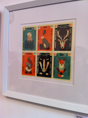
On another floor at were a collection of studios and agencies that had each brought a selection of artists, illustrators and designers' work. One that I really liked was Tom Frost who was with 'Soma'. He had a gorgeous collection of prints on display which included a group of animal stamps. The frame with an otter, rabbit, deer, squirrel, badger and fox was my favourite. The outline of the stamp and the simple patterns and shapes on the animals really made the piece stand out in my mind. I love the symmetry of the illustrations and also the muted colour tone - it really lends itself well to the subject matter.
Overall Pick Me Up was a great event and it was so inspiring to walk round and be surrounded by all that amazing work. I'd love to go back next year when I had more time to look at everything properly! I love the fact it was designers and illustrators under one roof, there was such a multitude of styles which made it really interesting and quirky.


No comments:
Post a Comment