Tuesday, 10 May 2011

123

Simplify line and shape (Ian Murray)
I think Ian first talked to me about this during the 'James and the Giant Peach' project. I was considering doing a very busy design so he suggested making the elements as basic as possible. It was quite hard at first to simplify everything down but I was really pleased I did, otherwise the final piece would have been so hectic! I've carried this principle on whenever I've produced a busy design, such as the Wellspring and 8x8, and I think it works well. Next year I'd like to try combining this idea with making a more elaborate composition and see what happens!

Love and enjoy what you do
(Hannah Firmin)
This may seem obvious but I've realised how important it is to enjoy what you do. Sometimes I've been made to feel that because my work is created purely digitally, it doesn't have a 'soul' and looks too generic. I've often thought that maybe I should try adding textures and hand drawn elements to my work to make myself feel more like an illustrator. However, I've realised that I really enjoy working in the way that I do and I shouldn't feel bad about it. Two of my favourite illustrators at the moment, Patrick Hruby and Arlene Adams, both work purely with Adobe Illustrator and their work is doing really well. All that matters is that I enjoy what I do!

Do what you feel is right (Ian Murray)
I find it really difficult to decide if my ideas are working or what I've produced is good enough. I need reassurance that I'm going in the right direction and I really need to trust myself more. During the 'James and the Giant Peach' project I was changing my mind a lot and when I spoke to Ian he just said to do what felt right. In the 8x8 project I think I became a bit more confident and made decisions on my own. At the end of the day, I'm not going to be at uni forever and I need to learn to trust my judgement if I'm going to succeed.

Monday, 9 May 2011

Arlene Adams - Contact Report

So I got in touch with Arlene Adams to ask her a few questions and she got back to me! Here are her answers:

Looking at your website, your new work is very different to your previous work. What caused this change?
There were a couple of reasons for the change. I had a few years out of illustration when I had my little boy. I came back afresh wanting a change in direction and a desire to do something new. Also when you work in a style that is quite fashionable inevitably your work has to evolve.

What are your inspirations? Do any artists/designers inspire you?
I like Alexander Girard and a lot of mid century design. I collect a lot of mid century objects and books which have influenced my work recently.

You obviously love using colour, how do you know when enough is enough?
I think it is just an intuitive thing. Working digitally now has made it a lot easier to play around with different colour combinations.

Would you be able to tell me about your working process? How do you get started on a project?
A lot depends on the brief and how open it is. I may gather some reference material if needed (now a lot easier with the internet). I start with pencil sketches which I scan, then work in Illustrator.

Are you ever stuck for ideas? If so how do you overcome this?
It is not that I get stuck for ideas more that I find it difficult to decide on what idea to go with. I find it easier working to a brief as I am very indecisive and the options are more limited.

The elements in your pieces are often symmetrical and your designs in general seem to play with this idea, is this a conscious thing?
I think this is something that has evolved but comes quite naturally to me. I am quite an ordered person so perhaps this is reflected in my work!

Is there any advice you would give to an aspiring illustrator?
If you want to make a living from being an illustrator you have to find a balance in being true to yourself and doing work that is commercial - which isn't always easy!!! You often have to compromise to keep a client happy! It is not a 9-5 job - you will have quiet periods and (hopefully) hectic ones. 'By perseverance' which happens to be my old school motto!


Saturday, 7 May 2011

8x8

For the past few weeks I've been working on a project entitled 8x8 which is a collaboration with creative writing students from Manchester Metropolitan University. Eight students have written a short story and we get the chance to do the accompanying illustrations, with all the work being featured in a book and sold at the Didsbury Art Festival. However, only one illustration per story can be chosen to feature alongside the stories and there are two or three people working on each story!
The story I was assigned to is called 'Junctures' and is written by Anna Paldanius. The story revolves around a girl called Joy, who has a long time boyfriend called Frank. Joy cheats on Frank with a man called Jack, who she eventually falls in love with. Realising she loves two men she cannot choose who to be with and who to break up with. Eventually both men find out they have been lied to and leave her. Frank ends up killing herself and at his funeral Joy realises she loved him the most. At the end of the story, set a few years later, Jack runs into Joy and her young son. It is implied Jack or Frank are probably the father of the child but we are not told which one.
My foremost idea for the main illustration was a treasure chest with a lock in the shape of a heart. The lock has two keyholes representing that two men 'have the key' to her heart. I decided to build up a symmetrical pattern representing the two different men and the choice Joy has to make - one or the other. Surrounding the chest are various elements which symbolise the eight chapter headings in the story:
Despair - stormy sea
Joy - yellow flower
Love - heart
Innocence - acacia leaf
Decadence - bitten chocolate (self indulgence)
Anger - bull
Sorrow - teardrop
Happiness - sun
I also included playing cards to represent the chance and risk Joy is taking and arrows which suggest choice and different directions. For the spot illustration I took the elements I had already made and arranged them in the shape of a heart - I thought 'love' was the overriding theme in the story. However, I can't decide between putting yellow in the background or not...I think it ties the two pieces together but not sure if I need it or not?
I'm really pleased with the final outcomes, I think the main illustration in particular is very striking. I like the black background as it just adds a sense of darkness which the story has. The simple elements work well and I like the symmetrical look - it adds balance to the piece and gives it more of an impact as opposed to it being asymmetrical.


Friday, 22 April 2011

I wish I'd done this


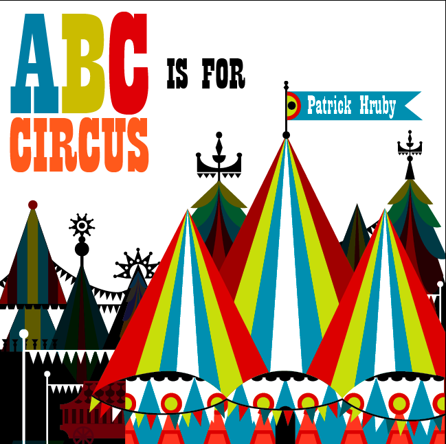
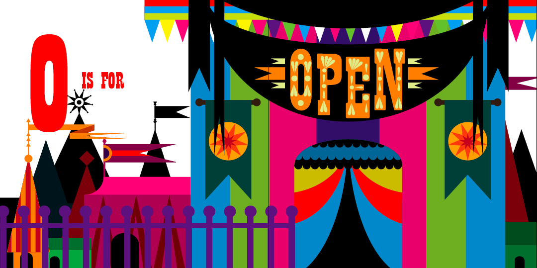
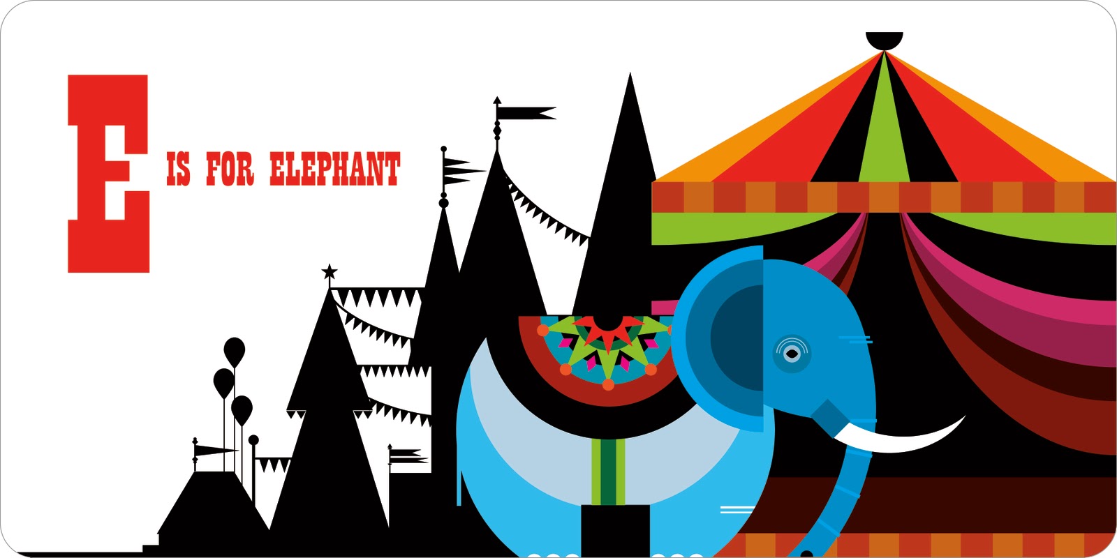
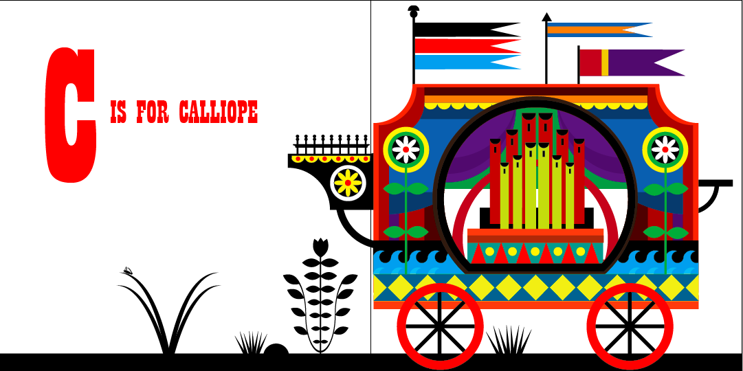
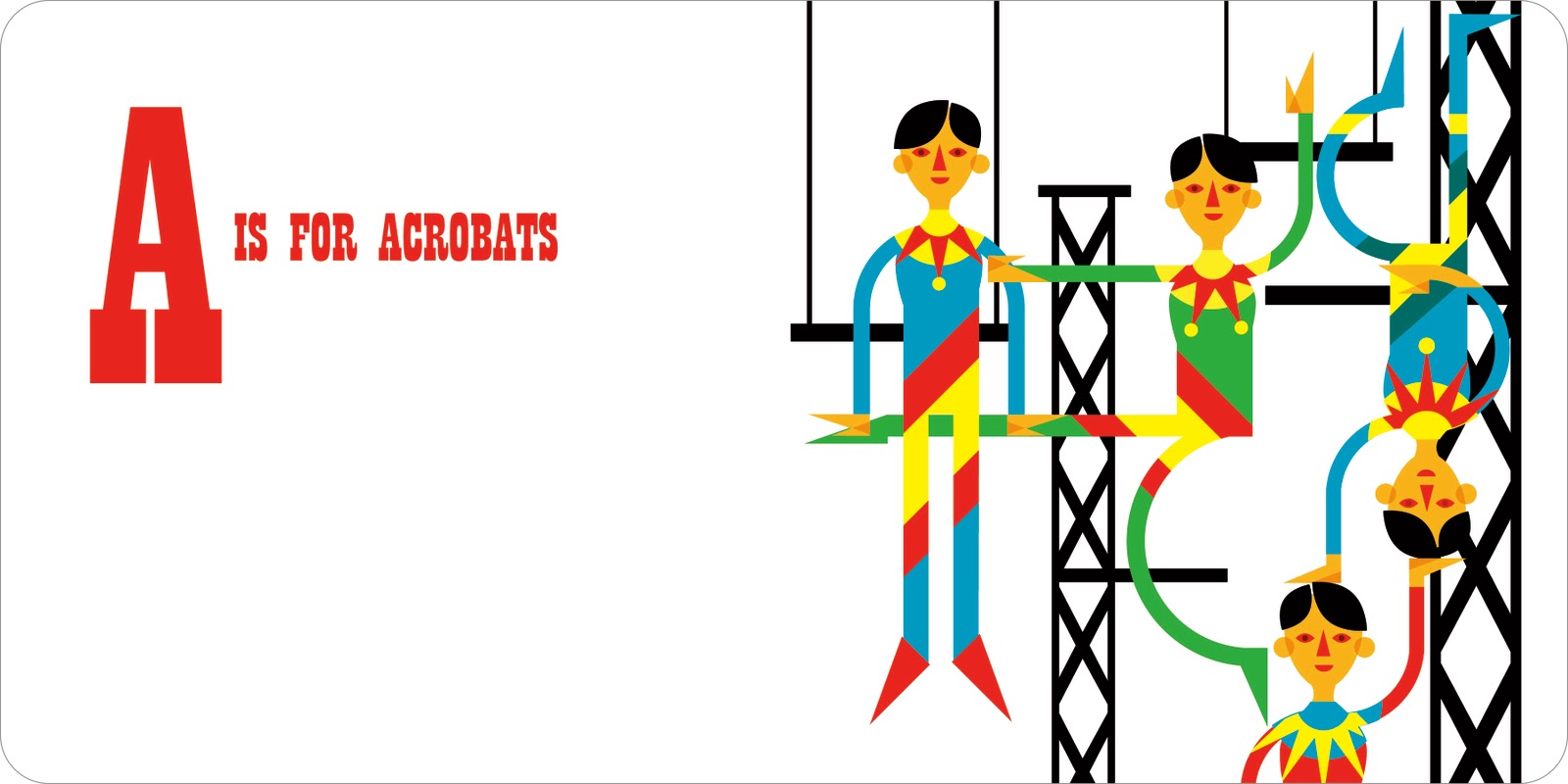
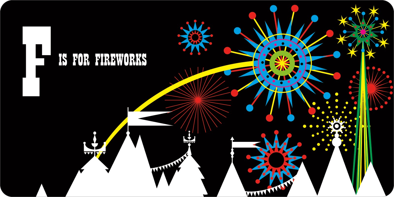
I know that we're only supposed to talk about one image, but I just love all of the illustrations Patrick Hruby created for the book 'ABC is for Circus'. The book celebrates the colourful and wonderful world of the circus through each letter of the alphabet. When I first saw it, I was mesmerised - it was so imaginative and beautiful. Each double page spread is completely different, with the composition of the pages changing each time.


The first thing that strikes you, in these images, is the colour. Patrick has a brilliant eye and although some of the images are packed full of different colours, it never looks too much. He knows exactly when to stop and which colours work best together. I also like how he adds black to a lot of the images - it makes the bright colours pop out of the page even more and adds a certain amount of depth to the pieces. Colour is very important to me and I am hugely influenced by Patrick's ability to control the colour in his illustrations. Although I have experimented with colour, I would really like to create a piece where all the colours are 'touching' each other and not separated by black - it would be interesting to see how I would cope with this technique.


Patrick produces most of his work on Illustrator which allows him to create a smooth line to compliment the bold shapes and colours. The circus designs include a lot of intricate shapes which are often layered over each other. Although I can use Illustrator fairly well, I think the next step in improving my work is to produce more complex designs. I love how Patrick uses lots of simple shapes but builds them up in such a way that the finished result is very elaborate. This technique is definitely something I could use in my own work, in order to add another level of interest.


Patrick likes to create his own fonts and I really like the one he's used for the circus book. It's fairly simple but I like this as it doesn't draw attention away from the main illustrations. I dabbled in creating a font when I did my James and the Giant Peach cover and I thought it worked rather well. In the future, I liked to try and create a font which combines my love of colour with shape. On his website, there's an example of Patrick doing this really well, by overlapping simple shapes to produce a really quirky font.


One of the things that I love most about this book are the background elements. On various pages, Patrick has created a black silhouette of a circus scene to use as a background. As said before, I think the black makes the bright colours of the main image stand out even more. It also adds another layer of interest and creates a sense of depth. One of the most successful images that uses this idea is the 'daredevil' page. I love the detail of the silhouette - he has obviously spent just as long on that as the foreground image. In future work, I'd really like to experiment with combining colour and pattern with black - I think Patrick's use of this idea is very striking.


The main reason I love Patrick's work is because of his use of shape. When you zoom into one of his pieces, you see a series of simple shapes - but he builds them up into intricate patterns that become figures and elements. I particularly love the 'acrobats' page in the circus book, it's so wonderful and quirky. Two of the figure's legs are almost perfect circles and all of their hands are created from triangles. The sharp edges of the graphic shapes really compliment the vibrant colours, all of which makes the finished designs really bold and eye-catching. It's such a clever technique and combined with his use of colour and pattern, really sets him apart from other illustrators today. I love how you can see a clear connection between all of Patrick's work, right through to his typography, where he also uses simple shapes.


Although you can view a lot of the Circus book online, I've ordered a copy for myself! In 'real-life' I think the images will be even more stunning than they are on the computer screen. Patrick's use of colour, shape and technique make him my favourite illustrator today and I can't wait until the book arrives!


Wednesday, 20 April 2011

Hannah Firmin - Contact Report

I emailed the lovely Hannah Firmin and asked her a few questions. She emailed back and gave some really good answers:

I understand you have recently moved to Wales, does living there have an impact on your work?
Living in Wales will influence me I'm sure, it's a bit early yet as I haven't had time to produce work for myself, I am selling well in local galleries and have been invited to exhibit during the Hay Festival in a few weeks time. I am always inspired by my surroundings....I lived in a village with a windmill above my house....see how many times you can spot a windmill in my work!

Where does your love of bright colours and patterns stem from?
I have always loved textiles, and sew and knit myself. Patterns and decoration in everyday life are very important to enrich our lives. Travelling the world shows you this too, I loved the fact that in Bali even the road sweepers wear beautiful sarongs and head dresses!

What are your inspirations? Do any artists/illustrators inspire you?
Some of the artists that have inspired me are Picasso, Bonnard, Thomas Bewick the engraver, Edward Bawden, Edward Ardizzone, John Piper, amongst many others!

Are you ever stuck for ideas? If so how do you overcome this?
Usually I have to work to a deadline so I can't ever be stuck. I will look at books and other people's work, go to an exhibition or just go out and do some drawing of I can't proceed.

Would you be able to tell me about your working process? How do you get started on a brief?
If I am doing a book jacket I always read the book until an image stands out. If it's something else I will usually have a size to work to which helps me with the general design. If the subject is new to me I will research and do some drawing before designing a composition. Once the rough has been approved I have to transfer it, in reverse, to my chosen block, lino, wood or vinyl. I cut it with the engraving tools, print and then when dry I cut up and collage and then finally paint. A long and elaborate process, which I love.

When did you get into printmaking, have you always used this process in your work?
I have done linocuts since a small child and etching at college, so almost all my life! It is always my chosen medium and I have become known for this way of working....my identity as an artist.

What did winning the Best Cover of the Year at the British Book Awards for the 'The No. 1 Ladies' Detective Agency' mean to you? Did it increase your profile?
Winning the award was great as it did increase awareness of my work and a lot of work developed from A.McCall Smith's popularity and his choice to continue using me for his covers. When you work freelance and at home there aren't many chances to gain recognition and acknowledgement for all one's hard work (I have worked as an illustrator since 1981!) so it was lovely to win (I wasn't invited to the award ceremony though!)

Is there any advice you would give to an aspiring illustrator?
My advice is to work in a medium you love and develop continually as, if you are intending on doing this for your life, you need to love and enjoy it! Aim at developing your individuality and skills personal to you.


Saturday, 16 April 2011

Maria Dahlgren

I went to Ikea last week and found these amazing postcards by a designer called Maria Dahlgren. The postcards feature five areas of Sweden and are very colourful and graphic in style. I love her use of lettering and the strong architectural angles are complimented by dazzling colours. There are so many different little elements and I really like the simplicity of the shapes and lines. Maria previously designed a tray and tea-towel which captured many of London's famous sites - her city designs have become very popular and fashionable. Recently, I am really liking Scandinavian art - I love the graphic yet patterned designs which can be inspired by a multitude of themes.


Monday, 11 April 2011

Jamie Brown

One of the briefs I'm working on at the moment is for a graphic design agency in Manchester called Music. Our task is to design a installation for a glass room in their studio. Ian gave us a presentation to give us some ideas for the project and one of the artists on it caught my eye straight away: Jamie Brown.
Jamie's illustrations are the sort of thing I envisage myself doing for this brief. His work is extremely bold and bright and full of different elements. I love the playful nature to his work - there are often little twists that you don't immediately notice. I really like how he uses fairly simple shapes to build up the image - this is something I will need to try and do if I'm going to use vinyl to create my design.
The song I've got in mind at the moment is "Lucy in the Sky with Diamonds' - which is a very psychedelic and has lots of brilliant imagery. In my head I see a really bold and colourful pattern covering the glass walls. I will definitely keep referring to Jamie's work to gain inspiration during this brief.