Tuesday 29 November 2011

Lord Whitney

On Monday 21st we had a lecture by Lord Whitney - a collaboration between Amy Lord and Rebekah Whitney (get it?!). Technically they're art directors but they prefer the term 3D illustrators! They graduated from Leeds Metropolitan Uni in 2006 where they both studied Graphic Art and Design, but neither of them really fit into traditional graphic design. However, their degree offered them the chance to experiment with a broad range of working methods such as photography and illustration. Both of them had an interest in film/narrative and creating stories. They liked to make quirky pieces and costumes and were influenced by theatre, film and literature.


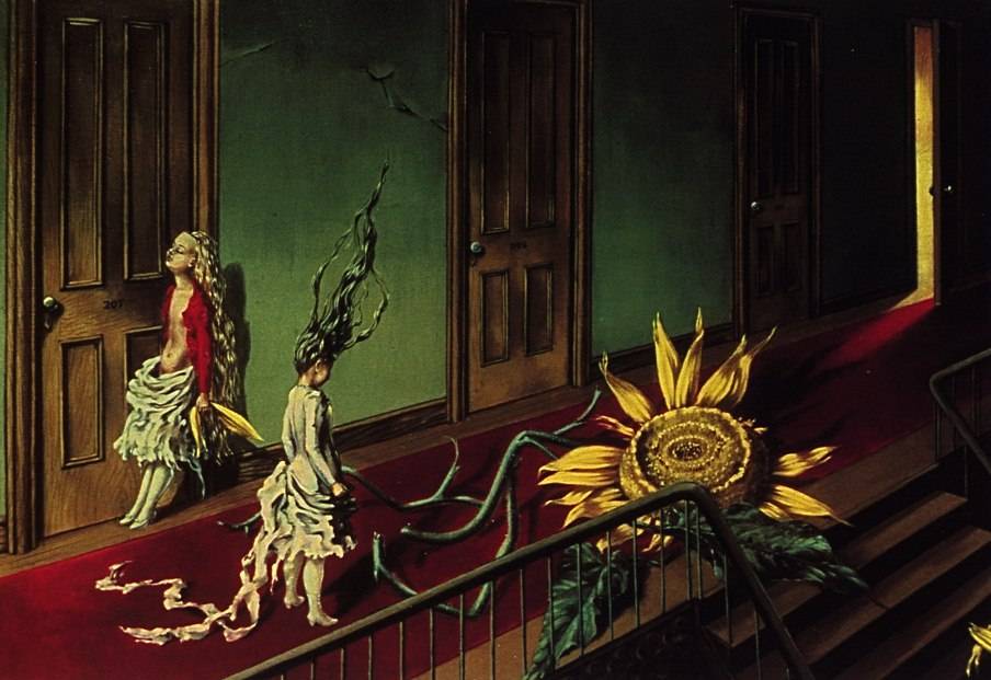
Rebekah focused on illustration and liked to make collages inspired by the silly and fun - Spike Milligan and Salvador Dali were favourites of hers. She moved on to make larger sets, but struggled to photograph them correctly. Amy, on the other hand, liked photography but struggled to find the right subject matter.


Then a month before graduating, their tutor suggest the utilise their skills and team up, which they did. They created a life size set based on A Midsummer Night's Dream which they both thoroughly enjoyed doing. Throughout the process they discovered how well they got on and what they could achieve working together.


Unfortunately, at this point, Uni was coming to an end - but this didn't stop them. They decided to collaborate full time and came up with their brilliant name. But without the Uni studio space and the sudden lack of student loans, work came to a standstill. They both temped and did freelance work to bring in some money, this way they were able to carry on with their own personal projects. They tried lots of different things, never for the sake of it and always using whatever was to hand. A friend of theirs then pointed them in the direction of a room over a pub and it was here that they were able to build and photograph larger sets.


They decided to set themselves a full project, something which they could fully concentrate on and explore thoroughly. They chose the theme of the circus/freak shows and saved up to be able to fund all the materials they wanted to use. The end result was 'The Curious Circus Sideshow' and a couple of months later they decorated a party for Culture Vulture blog using this theme.


After this job, work steadily began coming in until they had enough money to focus all their time on Lord Whitney and get a studio of their own. All the places they looked at were either too expensive or full, but eventually they managed to acquire a top floor mill space. The room needed a lot of work but they could see the potential. This is what was really great about the girls, they were obviously so dedicated to their dreams and wouldn't let anything get in their way.


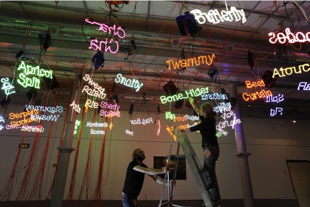
Over the last few years they discovered they could apply their skills to lots of different areas. They have worked in festivals, set design, books and art direction. They find inspiration from everywhere and anywhere. They stressed to us the importance of looking elsewhere for inspiration - shops, the outdoors, your hobbies.


They have stayed close to Uni friends and said Twitter, Facebook and blogs are a great way of retaining these relationships and also for forging new ones. Networking is key to the design industry, you can't expect people to come and find you - you have to get out there.


Another piece of advice they gave was to stand up for yourself. Many graduates will work for free just to get their work published, but the girls stressed that you should never do it more than once. People will take advantage of you and you'll end up never getting paid!


I really enjoyed the lecture; Lord Whitney are two very lovely girls who proved if you work hard enough you'll get what you deserve. They never gave up on their dream and I think it inspired everyone to keep pursuing their goals. As they said, lots of people fall at the first hurdle but if you keep going, eventually everyone else will fall away!


Sunday 27 November 2011

Portfolio Visit 2 - Music


On Friday 25th I had my second portfolio visit with the lovely Craig from Music, which is in the Ancoats area of Manchester. I felt much more comfortable during this visit as, in the summer, I spent three days at Music putting up my Lucy in the Sky with Diamonds design, so I know Craig fairly well. We started with a chat about how I was getting on at Uni and what I was working on at the moment. Then it was down to business...
I was a bit more confident about talking about my work after Taylor O'Brien so I launched straight into an explanation of the Wellspring image. He really liked this piece and loved the fact I'd bought the newspaper along as well so he could see it in context. He said all the elements were really nice but suggested changing the type as he thought it didn't quite fit with the geometric shapes in the rest of the piece. Being a designer, he said he was automatically drawn to the type and just to make it a bit more uniformed, which I completely agree with.
We then moved on to my recently created characters. I explained to him that although I am beginning to feel more confident with designing bodies, I am still finding the faces difficult. He suggested experimenting with taking all the facial features off or to simply have one feature like a nose to show the character. He said loosing the detail might make the images even stronger. I thought this was a great idea and will definitely give it a go.
This led on to a discussion about how much detail I should include in my images. Craig said it's really important for all designers and illustrators to be critical of themselves. In loosing some of the small details in my work he said my work will become more and more consistent. For example: in my 8x8 main image, do I need the little green line to distinguish the signpost and in the Native American image do I need the lines in the feathers? It's little things like that that will make my work more 'purist'.
Like Helen Taylor, Craig really loved my Russian and Indian images from the zine book. In particular he was really impressed with my choice of type. He said he could tell I'd thought carefully about what style of fonts would fit the theme of the images. He commented that a lot of illustrators struggle with typography so he was pleased with my efforts.
Another suggestion he made was to perhaps put a drop shadow around the images that had no defining edges. He said the light grey lines I have are fine but shadows might just lift the images off the pages a bit.
He also said my work was strong enough to be made into 'things', like my paisley cards. This could be another avenue to explore in order to further progress my work.
When we had finished looking through the portfolio he said he loved my work and was struggling to find any criticism so any feedback he had given was just being picky. I was so amazed at this but really pleased that he liked everything! To top it off he said it was one of the best student portfolios he'd seen (wanted to start singing at this point!!).
Towards the end of the visit, having had a talk with Ian about adding texture and mark making into my work, I asked Craig what his opinion was on this. He said he didn't think my work needed anything else but there would be no harm in experimenting with the idea. He said if I didn't like the outcome I should be confident in saying so. Everyone has their own points of view but if you feel strongly about something don't let someone persuade you otherwise.
This was a very positive visit, I felt much more relaxed and Craig was so great to talk to. I haven't felt as good about my work as I did last year, so to hear Craig saying he liked it really boosted my confidence. He said he'd love to work with me again and was sure there would be a moment when he'd say 'we need Philippa for that'...I couldn't have asked for anything better than that! Thanks Craig!

Saturday 26 November 2011

Portfolio Visit 1 - Taylor O'Brien


On Tuesday 22nd I had an appointment to see Helen Taylor at Taylor O'Brien, which is based just off Piccadilly in the Northern Quarter of Manchester. This being my first portfolio visit, I was quite nervous and unsure of what to do. However, Helen made me feel really comfortable and led me in with a few questions about what I was doing at the moment and where I would like to be in a years time. We were also joined by head designer Lee Millward, who was equally nice and easy to talk to.
We then moved onto my actual portfolio...not being sure what to do, I just opened it up and started to explain the first piece (Wellspring). I basically just ran through the brief, my various ideas and how I eventually created the piece.
This process carried on throughout the rest of the portfolio, Helen and Lee made the odd small comment but they saved the majority of their feedback until they had seen everything - this scared me a little, I didn't think they liked anything!
However, they really liked the graphic style to my work saying it was very commercial and they could easily visualise it being used in magazines etc. Helen in particular really loved the Russian page from my zine book. She said she could see it in a travel magazine/guide as it encapsulated Russia perfectly and the image was very tight and together. She suggested adding other pages from the book to my portfolio (which I've since done) to show how the images work together. Helen loved the relationship between all the elements, they all looked as though they belonged together and had the same style.
Looking through my portfolio again Helen and Lee agreed that the black and white and two tone images were the strongest. This quite surprised me - as I love colour! They said the Wellspring, the spot 8x8 and the Craig poster all seemed very bold and attention grabbing. They asked me about how I found working in black and white and I explained that I wasn't very confident so I would create a colour image and greyscale it. They said it would be good to see other images in black and white and that this could strengthen my portfolio and show a greater range of my capabilities.
Helen also really liked the James and the Giant Peach cover, saying it was very psychedelic and reminiscent of Sgt Pepper's Lonely Hearts Club Band. They liked the fact that I had gone against tradition and chosen not to include the main characters on the front and focused on the smaller elements.
They said my portfolio showed a really good variety of work; I'd included characters out of context, photos of work in context, editorial and book covers - so this was good to hear. They said it was different to the other portfolios they'd seen from Stockport, which they liked - it showed everyone has really individual styles.
They then asked quite a few questions about working with clients and how I've found those experiences. They were also interested to know if I'd ever had to change my work for clients and how I coped with it. We also talked about how I was getting quicker at using Illustrator, which was good as they said a lot of editorial jobs required quick turnarounds.
Overall I think it was a successful and worthwhile visit. Helen and Lee were very helpful and seemed to really like my work, the fact they can visualise it being used 'in the real world' was extremely encouraging. Although I was nervous, I think I came across relatively calm and felt confident in explaining my work and thought processes. It was really useful to receive feedback from people in the design industry, Uni is a bit like a bubble so its always nice to get out and hear other people's opinions. Thanks Helen and Lee!

Wednesday 23 November 2011

Website Research

When I think about designing my own website, it's a bit daunting - there are so many things I want to do! Obviously I want it to be quite colourful and eye-catching but the main thing I want it to be is easy to navigate. I've been on so many websites which are really confusing to find your way around - it's so annoying when you can't find simple things like the contact page.
For this post I'm just going to list some websites I think are successful and which elements I would like to try and replicate for my own page. There are so many great websites out there, but I've narrowed it down to a few of my favourites...
An illustrator I recently discovered is Jonny Wan, who is based right here in Manchester. His work is amazingly intricate and pattern based but with a mechanical/graphic edge. His website is really simple in concept but I think it works so well. On a thick strip of white at the top of the page are his bold logo and some basic links - about me/contact and facebook, twitter etc. Then below this are previews of his work with relevant titles and genres. These large thumbnails are on a black background, which really make the bright colours of the pieces stand out. By clicking on the images you are taken to a large version, but the 'portfolio' is still at the bottom of the page which I think is a nice touch.
I also really love Sanna Annukka's website, in particular the opening page which just features her name with a bold pattern typical of her style. I think it's really important to stand out and catch your audience's eye and this definitely does this. Sanna's website also features easy to use drop down menus at the top of the page. When you go to the individual pages for pieces of work I like how she hasn't just got one image of the piece, but a whole array of images showing work in context, photographed at different angles etc.
A lot of websites just list their links across the top of the page, but Jane Foster has incorporated them into her designs - it's simple but very effective. The little pops of colour add a touch of brightness to what is usually a plain area on other sites.
Patrick Hruby has an interesting website in the sense that, when you click on a piece of work listed on the left - you aren't taken to another page, but you're 'scrolled' through all his work until you reach the one you want. I think this is quite clever as you get to see a lot more work than you normally would, good for potential clients perhaps?
I'm really looking forward to creating my own website! I've got a lot of ideas from looking at other people's sites and I hope to incorporate the best bits into mine. I think the essentials are to have an eye-catching homepage, easy to navigate links/menus and previews of work which are immediately on display.

Saturday 19 November 2011

Alice in Wonderland Exhibition at Tate Liverpool

On Monday I took a little trip to Liverpool with Becca and Chloe to see the Alice in Wonderland exhibition at Tate Liverpool, which is running from 4th November to 29 January 2012. According to the gallery the exhibition 'provides the first comprehensive exploration of the stories influence on the visual arts, providing insight to their creation and the adoption and revision of their themes and characters by artists up to the present day'.
Lewis Carroll's timeless books are amazing, but apparently they're a lot more complex than you realise: 'his stories are rich in logical, philosophical and linguistic puzzles - reflecting their author's fascination with language and with questions of meaning'.
So we got in with 10% off the student ticket (don't ask me why, but not complaining!) and went into the first exhibition room which was on the ground floor. The room had giant, extravagant curtains on the entrance so I was quite excited to see what was inside. However, I was a bit disappointed. The first thing that catches your eye is Jason Rhoades' Tate Touche from My Madinah: in pursuit of my ermitage, which was created in 2004:


This installation basically consisted of a series of neon words hanging from the ceiling, along with lots of wires and cables. The range of words were really weird and wonderful; trout basket, Sigourney Weaver, apricot split and flapjacks were amongst the collection. Some of the words were perhaps not suitable for children so you immediately got the sense that this exhibition wasn't going to be the Disney/Tim Burton inspired adventure I'd expected. Nevertheless, I quite liked the piece - it was really colourful and crazy, just like Wonderland I suppose. The neon colours were really bright and bounced off the surrounding walls, it was a nice contrast to some of the other pieces in the room.
At the opposite end was a huge painting by Luc Tuymans called Wonderland (2007):


It was a beautiful piece but was very cold in colour and didn't really shout Alice in Wonderland - more the Snow Queen. Apparently it's based on the entrance to an Alice ride in Disneyland, but the colours are so stripped back I don't think anyone would recognise it.
There were also 3 really interesting photographs in the room by a Swiss artist called Annelies Strba, whose style is described as 'digital impressionism'. They are from a series called Nyima and feature girls lying asleep in woodland-type areas:


I really liked the effect of these pieces, the girls are glowing/radiating and they look quite magical. The colours achieved are really bright and bold, you can tell they are done digitally but that just adds to the appeal. Although the girls look really sweet and innocent, there's something slightly sinister about the photographs, are they really asleep??
After this first room we headed up to the fourth floor for the rest of the exhibition. Upon arriving I was quite surprised. The room was quite dark and was organised like any other exhibition, with pictures formally hanging all the way around the room with large chunks of text explaining the history of Alice in Wonderland. Some of this was fairly interesting, for instance I didn't know Lewis Carroll was actually a pseudonym for Charles Lutwidge Dodgson. The first part of this floor was dedicated to the early manuscripts of Alice in Wonderland which Carroll illustrated himself. We then get to the more recognisable illustrations of John Tenniel, when Carroll decided to use a more professional artist when the book was first published.


In a side room, more traditional pieces influenced by or depicting Alice in Wonderland were displayed. There were numerous cabinets with rows of books and illustrations which were mostly created in the late 19th and early 20th century. Below are just a few of the ones that I particularly liked:


Maria L Kirk, Alice Through the Looking-Glass, 1905.


Andre Jourcin, Alice in Wonderland, 1945.


Thomas Robinson, Alice in Wonderland, 1908.


Adrienne Segur, Alice in Wonderland, 1949.


Deloss McGraw, Alice in Wonderland, 2001.


Tove Jassonn, 1966.


Charles Handel Rand Marriott, Wonderland Quadrilles, artwork for piano sheet music, 1872.


Charles Francis Amesley Voysey, Alice in Wonderland fabric, 1920.

At the end of this room there was also a collection of old and modern books that you could look at. One that caught all our eyes was a pop-up book by Jotto Seibold:


It was a really fun, clever book which was a modern take on the old story. I loved the typography and illustrations, it was such a quirky book and was completely different to the more traditional items in that room.
The next section in the exhibition was dedicated to Surrealism. Surrealists shared Carroll's fascination for the uncanny and unexpected. They were drawn towards Carroll's fantastical worlds, where normal laws didn't apply and a random set of rules existed.


Max Ernst, Alice in 1941, 1941.


Dorothea Tanning, A Little Night Music, 1943.


Max Ernst, For Alice's Friends, 1957.


Max Ernst, Three Little Girls Set Out for the White Butterfly Hunt, 1958.

Towards the end of the Surrealist section were 12 illustrations which Salvador Dali had created. They were really mad and colourful - the combination of Dali and Alice was perfect. This is more of the type of thing I expected from the exhibition, he captured the essence of the story perfectly.

Mad Hatter Tea Party

Advice from a Caterpillar


Down the Rabbit Hole

In the final area of the exhibition, a section was dedicated to artwork from the 1960/70s. According to the information on display, the artists 'found a fruitful source of inspiration in the Alice books, particularly their depiction of a world freed from the conventional constraints of perception'.

Paul Laffoley, Alice Pleasance Liddell, 1968.


Peter Blake, Well This is Grand, 1970.


Adrian Piper, Alice Down the Rabbit Hole, 1966.

Adrian Piper, The Mad Hatter's Tea Party, 1966.


Adrian Piper, Alice and the Pack of Cards, 1966.


Graham Ovenden, Alice, 1970.


John Wesley, Falling Alice, 1963.

There were some interesting pieces in this bit, very colourful and psychedelic - just what I'd expect from that era. However, after this the exhibition went downhill. There were some movie clips, which as far as we could see had nothing to do with Alice, and to top it all off...a huge wall of pornographic text. I really thought this exhibition would be fun and interactive but it was completely the opposite. Alice in Wonderland was primarily a children's book but a lot of the exhibition was unsuitable for kids. I also didn't see one Disney drawing, which are really beautiful - I think there was a small section of the film played in a montage, but even this was hidden away in a little room. In my opinion, the exhibition was trying to be too clever and in doing so, lost the whole fun and essence of the story.

Saturday 12 November 2011

But Isn't That Your Job?

On Thursday 3rd Craig Oldham, from Music design agency, came to give a talk about his experience working with illustrators. He went through a series of 6 projects where illustrators had been enlisted and talked us through practically every bit of the process. It was an expletive filled lecture (which I loved!), but most importantly it was an honest and frank insight into his dealings with illustrators.
One of the projects he talked about was 'The Big Four', a series of posters commissioned by Manchester City to drum up attention for their next matches against the big four teams; Arsenal, Liverpool, Manchester United and Arsenal. The idea was to focus on one player per poster, a player who had relationships with both clubs playing in the current match. Craig wanted to create gig-like posters which could be plastered all over the city, he wanted these matches to be huge events that you wouldn't want to miss.
The first match was Man City vs Arsenal and the poster boy was Emmanuel Adebayor. To reflect Adebayor's slick style of playing, they recruited Michael Gillete (famous for his James Bond Penguin covers) to create a rock star poster. Craig talked us through the process of coming up with the idea, finding an illustrator, telling him what they wanted, changes that needed to be made, the fee they paid him etc. This project was fairly straightforward but it was really interesting to hear exactly what goes on in this type of commission.


The next poster for the Chelsea match featured Shaun Wright-Phillips. Craig wanted to depict the speed at which Shaun runs around the pitch. The first illustrator they found didn't quite make the mark and they struggled to find a replacement. In the end they discovered Chris White aka 3D Glasses who created this great illustration of Shaun firing round the pitch.


Next is was the Liverpool game and it was Craig Bellamy's turn to be the centre of the campaign. The idea behind this poster was to show the two sides of Bellamy - the aggressive and the passionate. For this they found the 'Picasso of gig posters' - Todd Slater. Craig said this was the easiest of the four posters as Todd immediately understood what they were after and produced it quickly without any problems. This is my favourite of the posters - I love the concept, the type and the beautiful illustration.


The last match was probably the biggest - the Manchester derby and there was only one contender for the poster: Carlos Tevez. He was adored by Man United fan's so you can imagine how they felt when he started playing for the club across the city; angry doesn't begin to cover it. Right from the start, Tevez was Man City's icon - he worked hard and played well. Music designed to work with Shepard Fairey and his agency Studio Number One to try and recreate the power of Fairey's famous 'Hope' poster. It wasn't all plain sailing though, there were problems in changing the design slightly but the finishing product ended up capturing the significance of the upcoming match.
The Manchester City campaign was highly successful and ended up creating a huge amount of interest in the matches. It also helped that all four players scored in the games they had respectively advertised!
Towards the end of the lecture, Craig gave some really useful advice - the first being that illustrators need to be more accessible. If a designer wanted to commission you but couldn't find any contact details, they'd give the job to someone else. Having a website, Facebook page etc is essential and his advice was to be more 'out there'.
He said designers will often ask you to change your image, but if you don't agree don't be afraid to stand your ground. Don't say no blatantly, but try to find a compromise where everyone's happy.
Craig also mentioned how important communication is. If you are unsure of something, ask! It's far better to ask the questions sooner rather than later when the designer is expecting a finished piece.
To round of the talk he said: if you want something badly and you work hard, eventually you'll get it. This was a great lecture - Craig didn't beat around the bush, he was straight to the point and very honest. He gave us a greater awareness of the industry we will enter into and gave some brilliant advice on how to cope and succeed. Thanks Craig!