Thursday 14 October 2010

Patrick Hruby

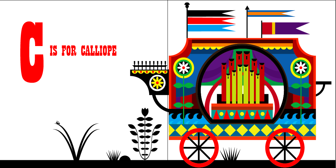
I've just been having a look around my new favourite site, the Print and Pattern blog, when I came across Patrick Hruby. I just had to give him a mention because I absolutely love his work! His sense of colour his amazing, it never looks too much or too little; always perfect. I like the almost graphic nature to his work, the sharp edges and shapes really compliment the colours and make them stand out. I've looked at his blog and website and the range of themes he covers is astonishing, he can do buildings, animals, people; all in different scenarios. He is my new favourite artist and I'm very jealous of him!!


Print and Pattern Blog

While researching for the box project I came across an amazing blog called Print and Pattern. It's my idea of heaven!! Not only do they show artists/designers work but they also go around shops like Paperchase and photograph loads of items. I'll share a couple of my favourite findings, starting with Pat Albeck.

Pat recently created a collection of tea-towels at Emma Bridgwater. I love her designs, she uses quite simple shapes and all of the colours are bright and happy. They're very 60s in style which is something I was very influenced by in the box project. I'm so impressed that Pat has been producing designs for over 40 years; they look so current and fresh. I will definitely be keeping me eyes open to see what she produces next.


Another designer who caught me eye was Carolyn Gavin. Her work she produced for the company Ecojet (which creates products made from recycled materials) is gorgeous! She has an amazing sense of colour and pattern and even though her designs have lots of things going on, they never look overcrowded. I particular like her letters made out of patterns, they look really effective and it's something I'd love to have a go at.


The design company Allihopa are also really inspiring. I love the bright, vibrant colours and the innocent images they create. I really like the colourful patterns set on black, it makes the colours 'pop' out of the page. They're designs are very simple, which is something I really like; they let the colours and images speak for themselves. I like how they've branched out into so many different areas; toys, notebooks, cards, stationery. There is obviously a great market for their work (including me!).


You can have a look at all the amazing work at printpattern.blogspot.com. Enjoy!!

Sunday 10 October 2010

Timorus Beasties

As my recent work has been very pattern based, Ian told me about a group of designers called Timorous Beasties. I had a look at their website and really loved their work. They produce contemporary fabrics and wallpapers reminiscent of Toile de Jouy wallpaper from the early 1800s. At first glance their patterns look like elegant panoramas, but look closer and the images are a grisly depiction of Britain today. They want to explore social and political issues and don't hold back on their subject matter. Prostitutes, tramps and drug users all feature in their controversial patterns, with crumbling buildings and seagulls serve as a backdrop. Once described as "William Morris on acid", the Timorous Beasties aren't afraid to explore taboo subjects, but by cleverly 'disguising' them in a traditional wallpaper style they have managed to create an extremely successful business.

Just to show a couple of examples, these are their London Toile and Glasgow Toile. The first image shows how 'normal' they look from a distance, whilst the second images are close ups which reveal their hidden meaning.


I think this is how to take my work to the next level; through letting my patterns be informed by themes and content. In the next project this is something I'd like to explore, it would be a good way to challenge myself and create work with a more serious content.

P.S. This is a really good video I found of Alistair McAuley and Paul Simmons (the founders of Timorous Beasties) discussing their working method and the ideas behind their work.