Saturday 17 December 2011

Hope, Fears and Opportunities (Part 1)

In September, we had a group meeting where we discussed and recorded our hopes, fears and opportunities. Four months later not a lot has changed! All of my hopes and fears are rather similar, although I do feel I am better equipped to achieve and conquer them.
I'm trying to take each day as it comes, otherwise I'd be overcome with panic! Obviously I want to get a good job and continue to do what I love, but at the moment my main hope is to do well in my degree. People have said that a grade isn't everything and that you are judged on your work not your academic success. Even though I know this is true, I would still love to get a first class degree. Over the past 5-6 years my concentration had been almost entirely on art. Even at A-level when I did two other subjects, I did double award art and since enrolling on the foundation course I've been immersed in the world of illustration. I feel I owe it to myself to work as hard as possible and aim for the best. It would be a great sense of achievement and I think I'd feel much more confident about my abilities.
In September I wrote I hoped to build a good portfolio and have three successful visits to people in the design industry. This is the one thing I feel I have fully achieved! Firstly my portfolio...I wanted the professionalism and style of the Prat Pampa portfolios but I also wanted one that would stand out a bit and reflect my work.


In the end I managed to get hold of this gorgeous pink Prat portfolio from America! It's slightly bigger than A4 and smaller than A3 which means I have to print on an A3 and cut it down, but it's worth it. When I went for a portfolio visit to Stuart from Thoughtful he said it was great to see something different and it definitely suited my work. I'm also really pleased with the actual content of my portfolio. I've got more work than I actually realised (which is always good) and I've got a few photographs of things in context, though this is something I could improve for next year.
My three portfolio visits have all gone really well. I was so nervous about them, especially at my first with Taylor O'Brien, but by the last one I felt more confident about explaining my work. They have been great practice for job interviews and I'm much more positive about meeting new people.
My other hopes are for further down the line - getting a job/commission and becoming an overall successful illustrator. I'm still not sure whether I see myself as a freelance illustrator. I'd like to work alongside other people but in-house illustration jobs are few and far between. Realistically, I think the best option would be to rent a studio with some other people. This way we could all work on our own freelance projects but still have that support network around us.


I would also really love to do another mural type project, similar to 'Lucy in the Sky with Diamonds'. I think my work is most successful when there's lots of different elements, which is something I have't done this academic year. This is something I definitely want to get back to for my Final Major Project. I'm not sure what the theme/idea will be - that will have to be sorted out later! I hope one day I will be able to do a paid installation somewhere, that's the one thing I can imagine myself doing well and really enjoying.


YCN agency have a lot of illustrators who create murals so it would be amazing to try and get represented by them. If possible, I hope to arrange meeting to see them when we go to London next year - that would be the dream scenario.
Like every student approaching graduation, I have quite a few fears. The main one is to not get a job...but after Stuart's lecture I realise this is not going to happen straightaway. I need to figure out exactly what it is I want to do and go from there. If I don't get a job in a studio, my other big fear is being on my own. To not have any advice from anyone else would be really difficult for me. Maybe I need to be more confident in myself but I really like just having a quick chat with someone else and seeing what they're up to. As I said before I think it would be good to share a studio with other people, even if it's just for a few months until we get accustomed to the world of freelancing.
I also fear having to 'get myself out there'. I'm not great at meeting new people but networking is crucial if you want to succeed in this business, I can't sit at home and expect work to come to me. The key to overcoming my nerves is perhaps to get an online presence first. A website, Facebook page and Twitter are all things I need to set up next year. Once this gets going I think it will be easier to establish contacts and give me confidence to speak face to face.
This brings me on to some aims I want to fulfil next year. First of all, I want to produce a good end of year show which will involve getting materials well in advance. While I'm at Uni I want to make the most of the resources they have, such as the photography and print room facilities. I will also aim to get in touch with more studios and agencies, I think these connections can be invaluable. When we go to London, I want to aim for the best so I'll need to research lots of different possibilities early on in the year and not leave it to the last minute.
To achieve all these things I need to keep working hard! After Christmas it's the final push and I don't want to look back and regret not putting enough effort in. Hopefully all the work will pay off!

Friday 16 December 2011

Portfolio Visit 3 - Thoughtful


Yesterday I had my final portfolio visit with Stuart Price from Thoughtful. Their studio is now based in Stockport College so I merely had to walk down to the meeting! Having already met Stuart after his lecture I wasn't too worried and felt confident as I talked through my work. The only thing that had me slightly concerned was the fact he set a timer for 20 minutes, I was a bit anxious I wouldn't be able to fill the time but in actual fact it was fine and we spoke right up to the alarm!
From the start Stuart said that because he wasn't an illustrator he wouldn't comment on the actual style of the work, but he'd look at it from a commercial aspect. I think this is actually a good thing as it's designers such as Stuart who will commission illustrators, so it's great to hear their opinions.
Stuart really loved the Wellspring image on the first page saying it was a really strong design. He asked how I created it and was impressed when I said it was done on Illustrator as he said he found it quite difficult to use. He liked all the elements and said even though they were digital, you could tell I'd drawn them first - they were personal to me.
Like Helen Taylor he also liked the graphic nature of the 8x8 spot illustration. It was interesting to see that all of the designers I've seen liked similar things. He said the two images worked well side by side and were very confident. He loved the colours in the main illustration saying they were quite striking.
Like Craig, he also liked the type on the Russia and India pages from the Zine book. He was particularly impressed with the Russian type, as he said it complimented the image really well. A lot of Russian fonts can be quite harsh but he said this one was well adapted to suit the illustration.
Next up was the Music brief and he liked that I'd included a picture of it installed on the glass. He said it looked professionally done and the design was really tight and together. He liked the concept behind the image and thought it was a well thought out piece.
Stuart was also impressed with the paisley pattern, simply because it's very detailed and he looked closely at it to see how I'd done it in Illustrator.
Moving on from this, he also really liked the 'Lonely' castle and was interested how I'd converted it into an Illustrator file to fit in with the rest of my portfolio. This led on to us talking about the process of my image making. I talked through how I sketch ideas and then trace over them in Illustrator, which he said was a good way of working.
We then came to the James and the Giant Peach book cover which he really loved. This was the first visit where I've had such a positive response for this piece, so it made me very happy! He liked the type and said it fitted well into the design. One thing he mentioned was that I perhaps didn't need a photograph of the book as it wasn't showing anything different. He suggested only photographing pieces that were in a different setting (such as Music) or had type surrounding it (such as 8x8). I hadn't really thought about it like that, but hearing him say it made perfect sense!
Flicking back through the portfolio, Stuart said he really liked everything - in particular the Wellspring, 8x8, Music, Zine pages and James and the Giant Peach. He liked the layout of the portfolio and said he didn't want it to stop, which is always a good sign. He also really loved the fact that I've got a pink portfolio saying that he saw a lot of black ones and it was nice to see a bit of personality. He said it suited my work and would immediately be noticed and remembered.
Overall this was a very positive visit. I got some great feedback and advice from Stuart which I will definitely take on board. He also said to keep in touch and to show him any new work as I did it - he said I could pop in any time which was really nice of him.
These portfolio visits have been so useful and not nearly as scary as I first thought! Each one has built my confidence and I've had some great tips on how to improve my work and portfolio. In each one I think I've improved when it comes to explaining my work and they've all been good practice for next year when things start to get 'real' and I'll hopefully be looking for paid commissions.

Wednesday 14 December 2011

Graphic Gurus

This year we have all been assigned 'Graphic Gurus' (graduates who will act as mentors throughout our final year) and mine is the lovely Natalie Wood. I recently sent her an email with my PDF portfolio and asked her for some advice/feedback to which she kindly responded.

Hi Philippa,

Sure that's fine, I remember meeting you at college.
Had a look at your profile, I really like your work. I love "Russia". You have a great sense of colour. I love how bold "Junctures" is too. One piece of advice that I'd probably give you would be to lose the occasional black outline that's in some of your work. Such as around the elephant and the feathers of the native american. Perhaps you could introduce some texture into your work too? Experiment with different print processes like screenprinting to get different effects and make your work look less like it was produced on screen. Other than that it all looks great. I like the layout of your portfolio too.

Hope this helps!
Nat

Natalie was really nice and was quite positive about my work. I agree with the comment about the outlines - I've already gone back and taken some away. I'm also in the process of experimenting with textures so we'll see how that goes!
I'll definitely keep in touch with Natalie, I think it will be so useful to have someone to talk to whose been through the whole degree process before - especially when it comes to the Final Major Project.

Tuesday 13 December 2011

Creative Review

Our class has had two Creative Reviews this year which have been a way sharing things we find interesting or inspiring. For these sessions we each had to bring a recommendation for a book, an article, a film and an exhibition. At the end of the meeting we could pin up our suggestions for other people to look at. They've been a useful way of finding out about new things and it's been nice to see everyone's individual interests. These are the things I recommended at the two reviews:

Books
The first book I chose was Print & Pattern, a bible of all things colourful, cute and patterned. It's created by Marie Perkins aka Bowie Style who is the author of the wonderful Print & Pattern blog. It's such a great reference book for inspiration on colour, ideas or technique. It's also just a really nice book to flick through, there's something detailed and interesting on every page. To anyone who loves a bit of pattern, I can readily recommend you look at this book.


The book I brought to the second review was ABC Is For Circus by the wonderful Patrick Hruby. This chunky book demonstrates exemplifies Patrick's love of geometrical shapes and bright colours. Technically it's a children's book, but adults will probably appreciate it more! Again, it's a great book for inspiration and it's all the more impressive when you realise Patrick only graduated in 2010.

Films
One of the films I recommended during the reviews was Black Swan. I watched it because I'm doing it for the Little White Lies competition and I really enjoyed it. I thought it was a clever film which was full of suspense and plenty of unexpected twists. Some of the scenes were very freaky, especially the ones where she 'turns' into the swan. Having seen the Swan Lake ballet I really liked the fact all the characters in the film mirrored the story exactly. It was skillfully shot, I don't know how they did all the mirror scenes, and Natalie Portman was surprisingly good as the black swan alter ego.
I didn't actually mention this film during the meetings but having watched it recently reminded me how much I love it. Up is, in my opinion, one of the best Pixar films (though they're all brilliant). The stand out character has to be Russell, an overly enthusiastic wilderness explorer.


Apart from the great characters it's also a beautiful film to look at. The South American scenery is so different and vibrant and the colourful house is picture perfect. I was so excited when the house is first lifted off the ground by thousands of balloons! It's a great little film and everyone should watch it at least once!

Articles
The article I brought to the first Creative Review was Illustration: The Art of Ornament from Computer Arts. It's actually quite an old article being from 2007, but it still made for an interesting read. It examines the history of decoration and how when modernism came along, ornamentation in art was in danger of being lost. Various illustrators also talk about how they use decorative qualities in their work and what processes they go through to achieve it.


The second article I chose was Make Digital Projects Seem Handmade from Digital Arts. In this current Little White Lies project I'm experimenting with adding texture to a part of the image, so I thought this was quite a relevant article. It talks about the new trend of trying to make digital work appear to be hand crafted. Illustrators such as Ben Newman talk about their opinions on the matter and also discuss their individual working methods. It's a really interesting debate and well worth a read.

Exhibitions
The first exhibition I talked about was the V&A Illustration Awards that I visited over the summer. Although the work on display was really good the actual exhibition space was so difficult to find! It was tucked away at the back of the gallery and was nothing more than a narrow walkway around a room. Anyway, there was some great work by Laura Carlin who illustrated 'The Iron Man' by Ted Hughes - I liked the simple shapes she used and all her work was displayed really nicely.


The second exhibition I chose is one I haven't actually been to, but would if I got the chance. The Indiscipline of Painting is on at Tate St Ives until 3rd January and it explores post-war modernist abstract painting. Artists such as Andy Warhol, Bridget Riley and Frank Stella are featured in the exhibition, which looks at how abstract art has continued to develop over the last 50 years despite the modernist movement decline. It looks like it would be great show and I would love to go, but with the combination of Christmas and the dissertation, it looks unlikely :(


Sunday 11 December 2011

A Thoughtful Presentation

On Thursday 8th there was a talk by Stuart Price who is from Thoughtful design studio - which is now based in Stockport College and works with Graphic Design students. The lecture was all about how to break into the industry e.g portfolio tips, how to contact people etc. It was a really interesting talk as Stuart had contacted studios and asked them lots of specific questions, which he then complied into all these charts! He also had lots of examples of good portfolios and there were videos of individual design 'people' being asked what they look for in a graduate.
Stuart started off by talking about problem solving. Convergent thinking is where there is one straight answer and divergent thinking is coming up with lots of answers/ideas. According to Dr Peter Lovatt, dancing improves the thinking process! If you do 15 minutes of structured dancing, you should become better at convergent thinking. Whereas 15 minutes of improvised dancing helps divergent thinking. We then did a series of little dancing moves which I thought would be a bit embarrassing but it was actually really funny!
Greg Quinton from The Partners says persistence is the key to success. People are very busy, so what's going to keep you in their mind? Once you establish contact with someone keep sending them new work to show how you are developing as a designer.
The first survey question asked 'what is the preferred method for first contact?' The majority of studios, with 78%, said an email is best. 18% said post letter/piece of work and 4% said just show up. When composing an initial email Stuart said it's good when people say something about the studio and the work as it shows they've taken the time to do some background research. Also, exclamation marks are a no-no(!), if you don't know someone it just looks unprofessional. A potential employer can see a generic email from a mile off, make sure you make it personal to the person you're sending it to. When attaching a file to an email make sure it's not too big, otherwise yours will be sent to the bottom of the queue - 5mb is ideal.
'What do you do if you don't get a response?' 46% of studios suggested a follow up email 3-4 days after the initial one. 20% said a phone call is acceptable. Adrian Shaughnessy said to stay open minded - you have to start all over again and you never stop learning in the design industry.
In regards to what should be in your opening email; a link to your website and a PDF of your work is recommended. The latter is perhaps the more important, so even if you don't have a website never send an empty email. The PDF should show about 5-7 projects and as said before should be around 5mb. Michael Johnson said you have to be prepared to do placements, you can't expect to go straight to the top.
Spelling errors are amongst the most common mistakes in portfolios, make sure someone else proof reads it first. When having an interview, another mistake people often make is to place their portfolio on front of themselves rather than the potential employer. You should be able to talk about your work even if it's upside down! Patrick Baglee says it's always better to be interested than interesting. You have to think of yourself as a brand; present yourself - sit up straight etc.
When asked 'what is the preferred portfolio layout?', most of the studios said they had no preference. A book with bound pages came second, but the fact that most had no preference shows that a portfolio can be individual to you - the more the better. The preferred amount of projects in a portfolio is 10 - but leave something out if you don't like it, only take work you are really confident in talking about.
Jonathan Baldwin says that talking to students from other courses in your Uni can be really useful, you can find inspiration in unexpected places. Similarly, Tony Davidson says it is important to visit different galleries and venues - be influenced by your surroundings.
The next survey question asked 'how much information should accompany each project?'. 45% of studios say some basic information is enough, but give credit where credit is due. If someone has helped you produce your work you must record it, it will be obvious and look selfish if you don't. Also, including sketches can be a nice touch as it shows employers how you arrived at a finished outcome.
When looking for a job, Pentagram's Paula Scher says it's vital not to just focus on money, you have to find somewhere that will give you the best opportunities. You won't necessarily be doing what you do in the first twelve months for the rest of your life; it's ok to make mistakes. You have to learn from these mistakes, pick yourself up and move on.
'How long should an interview last?' 50% of studios said 30 minutes, so prepare for that time but bear in mind it could be less. Before you start, it's always a good idea to ask how long you're going to have so you can manage your time appropriately. Michael Wolff says it's good to be inquisitive - it shows you take an interest in the company your trying to get a job at.
The final question was 'what do you look for in portfolios?' Great ideas and a good personality are equally important - you could have the best work in the world but no-one will employ you if they don't think you'll fit into their company.
At the end of the lecture Stuart said don't expect to land a job within the first 18 months of graduating, it might happen but be prepared that it won't. The most important thing is to never give up - if you have self belief it will happen for you.
This was an extremely useful lecture, I feel much more confident about approaching studios and Stuart provided some excellent tips on email/portfolio etiquette. All the facts and survey questions were really interesting, it's always good to hear thoughts from those in the industry. Great job Stuart, thanks!

Tuesday 29 November 2011

Lord Whitney

On Monday 21st we had a lecture by Lord Whitney - a collaboration between Amy Lord and Rebekah Whitney (get it?!). Technically they're art directors but they prefer the term 3D illustrators! They graduated from Leeds Metropolitan Uni in 2006 where they both studied Graphic Art and Design, but neither of them really fit into traditional graphic design. However, their degree offered them the chance to experiment with a broad range of working methods such as photography and illustration. Both of them had an interest in film/narrative and creating stories. They liked to make quirky pieces and costumes and were influenced by theatre, film and literature.


Rebekah focused on illustration and liked to make collages inspired by the silly and fun - Spike Milligan and Salvador Dali were favourites of hers. She moved on to make larger sets, but struggled to photograph them correctly. Amy, on the other hand, liked photography but struggled to find the right subject matter.


Then a month before graduating, their tutor suggest the utilise their skills and team up, which they did. They created a life size set based on A Midsummer Night's Dream which they both thoroughly enjoyed doing. Throughout the process they discovered how well they got on and what they could achieve working together.


Unfortunately, at this point, Uni was coming to an end - but this didn't stop them. They decided to collaborate full time and came up with their brilliant name. But without the Uni studio space and the sudden lack of student loans, work came to a standstill. They both temped and did freelance work to bring in some money, this way they were able to carry on with their own personal projects. They tried lots of different things, never for the sake of it and always using whatever was to hand. A friend of theirs then pointed them in the direction of a room over a pub and it was here that they were able to build and photograph larger sets.


They decided to set themselves a full project, something which they could fully concentrate on and explore thoroughly. They chose the theme of the circus/freak shows and saved up to be able to fund all the materials they wanted to use. The end result was 'The Curious Circus Sideshow' and a couple of months later they decorated a party for Culture Vulture blog using this theme.


After this job, work steadily began coming in until they had enough money to focus all their time on Lord Whitney and get a studio of their own. All the places they looked at were either too expensive or full, but eventually they managed to acquire a top floor mill space. The room needed a lot of work but they could see the potential. This is what was really great about the girls, they were obviously so dedicated to their dreams and wouldn't let anything get in their way.


Over the last few years they discovered they could apply their skills to lots of different areas. They have worked in festivals, set design, books and art direction. They find inspiration from everywhere and anywhere. They stressed to us the importance of looking elsewhere for inspiration - shops, the outdoors, your hobbies.


They have stayed close to Uni friends and said Twitter, Facebook and blogs are a great way of retaining these relationships and also for forging new ones. Networking is key to the design industry, you can't expect people to come and find you - you have to get out there.


Another piece of advice they gave was to stand up for yourself. Many graduates will work for free just to get their work published, but the girls stressed that you should never do it more than once. People will take advantage of you and you'll end up never getting paid!


I really enjoyed the lecture; Lord Whitney are two very lovely girls who proved if you work hard enough you'll get what you deserve. They never gave up on their dream and I think it inspired everyone to keep pursuing their goals. As they said, lots of people fall at the first hurdle but if you keep going, eventually everyone else will fall away!


Sunday 27 November 2011

Portfolio Visit 2 - Music


On Friday 25th I had my second portfolio visit with the lovely Craig from Music, which is in the Ancoats area of Manchester. I felt much more comfortable during this visit as, in the summer, I spent three days at Music putting up my Lucy in the Sky with Diamonds design, so I know Craig fairly well. We started with a chat about how I was getting on at Uni and what I was working on at the moment. Then it was down to business...
I was a bit more confident about talking about my work after Taylor O'Brien so I launched straight into an explanation of the Wellspring image. He really liked this piece and loved the fact I'd bought the newspaper along as well so he could see it in context. He said all the elements were really nice but suggested changing the type as he thought it didn't quite fit with the geometric shapes in the rest of the piece. Being a designer, he said he was automatically drawn to the type and just to make it a bit more uniformed, which I completely agree with.
We then moved on to my recently created characters. I explained to him that although I am beginning to feel more confident with designing bodies, I am still finding the faces difficult. He suggested experimenting with taking all the facial features off or to simply have one feature like a nose to show the character. He said loosing the detail might make the images even stronger. I thought this was a great idea and will definitely give it a go.
This led on to a discussion about how much detail I should include in my images. Craig said it's really important for all designers and illustrators to be critical of themselves. In loosing some of the small details in my work he said my work will become more and more consistent. For example: in my 8x8 main image, do I need the little green line to distinguish the signpost and in the Native American image do I need the lines in the feathers? It's little things like that that will make my work more 'purist'.
Like Helen Taylor, Craig really loved my Russian and Indian images from the zine book. In particular he was really impressed with my choice of type. He said he could tell I'd thought carefully about what style of fonts would fit the theme of the images. He commented that a lot of illustrators struggle with typography so he was pleased with my efforts.
Another suggestion he made was to perhaps put a drop shadow around the images that had no defining edges. He said the light grey lines I have are fine but shadows might just lift the images off the pages a bit.
He also said my work was strong enough to be made into 'things', like my paisley cards. This could be another avenue to explore in order to further progress my work.
When we had finished looking through the portfolio he said he loved my work and was struggling to find any criticism so any feedback he had given was just being picky. I was so amazed at this but really pleased that he liked everything! To top it off he said it was one of the best student portfolios he'd seen (wanted to start singing at this point!!).
Towards the end of the visit, having had a talk with Ian about adding texture and mark making into my work, I asked Craig what his opinion was on this. He said he didn't think my work needed anything else but there would be no harm in experimenting with the idea. He said if I didn't like the outcome I should be confident in saying so. Everyone has their own points of view but if you feel strongly about something don't let someone persuade you otherwise.
This was a very positive visit, I felt much more relaxed and Craig was so great to talk to. I haven't felt as good about my work as I did last year, so to hear Craig saying he liked it really boosted my confidence. He said he'd love to work with me again and was sure there would be a moment when he'd say 'we need Philippa for that'...I couldn't have asked for anything better than that! Thanks Craig!

Saturday 26 November 2011

Portfolio Visit 1 - Taylor O'Brien


On Tuesday 22nd I had an appointment to see Helen Taylor at Taylor O'Brien, which is based just off Piccadilly in the Northern Quarter of Manchester. This being my first portfolio visit, I was quite nervous and unsure of what to do. However, Helen made me feel really comfortable and led me in with a few questions about what I was doing at the moment and where I would like to be in a years time. We were also joined by head designer Lee Millward, who was equally nice and easy to talk to.
We then moved onto my actual portfolio...not being sure what to do, I just opened it up and started to explain the first piece (Wellspring). I basically just ran through the brief, my various ideas and how I eventually created the piece.
This process carried on throughout the rest of the portfolio, Helen and Lee made the odd small comment but they saved the majority of their feedback until they had seen everything - this scared me a little, I didn't think they liked anything!
However, they really liked the graphic style to my work saying it was very commercial and they could easily visualise it being used in magazines etc. Helen in particular really loved the Russian page from my zine book. She said she could see it in a travel magazine/guide as it encapsulated Russia perfectly and the image was very tight and together. She suggested adding other pages from the book to my portfolio (which I've since done) to show how the images work together. Helen loved the relationship between all the elements, they all looked as though they belonged together and had the same style.
Looking through my portfolio again Helen and Lee agreed that the black and white and two tone images were the strongest. This quite surprised me - as I love colour! They said the Wellspring, the spot 8x8 and the Craig poster all seemed very bold and attention grabbing. They asked me about how I found working in black and white and I explained that I wasn't very confident so I would create a colour image and greyscale it. They said it would be good to see other images in black and white and that this could strengthen my portfolio and show a greater range of my capabilities.
Helen also really liked the James and the Giant Peach cover, saying it was very psychedelic and reminiscent of Sgt Pepper's Lonely Hearts Club Band. They liked the fact that I had gone against tradition and chosen not to include the main characters on the front and focused on the smaller elements.
They said my portfolio showed a really good variety of work; I'd included characters out of context, photos of work in context, editorial and book covers - so this was good to hear. They said it was different to the other portfolios they'd seen from Stockport, which they liked - it showed everyone has really individual styles.
They then asked quite a few questions about working with clients and how I've found those experiences. They were also interested to know if I'd ever had to change my work for clients and how I coped with it. We also talked about how I was getting quicker at using Illustrator, which was good as they said a lot of editorial jobs required quick turnarounds.
Overall I think it was a successful and worthwhile visit. Helen and Lee were very helpful and seemed to really like my work, the fact they can visualise it being used 'in the real world' was extremely encouraging. Although I was nervous, I think I came across relatively calm and felt confident in explaining my work and thought processes. It was really useful to receive feedback from people in the design industry, Uni is a bit like a bubble so its always nice to get out and hear other people's opinions. Thanks Helen and Lee!

Wednesday 23 November 2011

Website Research

When I think about designing my own website, it's a bit daunting - there are so many things I want to do! Obviously I want it to be quite colourful and eye-catching but the main thing I want it to be is easy to navigate. I've been on so many websites which are really confusing to find your way around - it's so annoying when you can't find simple things like the contact page.
For this post I'm just going to list some websites I think are successful and which elements I would like to try and replicate for my own page. There are so many great websites out there, but I've narrowed it down to a few of my favourites...
An illustrator I recently discovered is Jonny Wan, who is based right here in Manchester. His work is amazingly intricate and pattern based but with a mechanical/graphic edge. His website is really simple in concept but I think it works so well. On a thick strip of white at the top of the page are his bold logo and some basic links - about me/contact and facebook, twitter etc. Then below this are previews of his work with relevant titles and genres. These large thumbnails are on a black background, which really make the bright colours of the pieces stand out. By clicking on the images you are taken to a large version, but the 'portfolio' is still at the bottom of the page which I think is a nice touch.
I also really love Sanna Annukka's website, in particular the opening page which just features her name with a bold pattern typical of her style. I think it's really important to stand out and catch your audience's eye and this definitely does this. Sanna's website also features easy to use drop down menus at the top of the page. When you go to the individual pages for pieces of work I like how she hasn't just got one image of the piece, but a whole array of images showing work in context, photographed at different angles etc.
A lot of websites just list their links across the top of the page, but Jane Foster has incorporated them into her designs - it's simple but very effective. The little pops of colour add a touch of brightness to what is usually a plain area on other sites.
Patrick Hruby has an interesting website in the sense that, when you click on a piece of work listed on the left - you aren't taken to another page, but you're 'scrolled' through all his work until you reach the one you want. I think this is quite clever as you get to see a lot more work than you normally would, good for potential clients perhaps?
I'm really looking forward to creating my own website! I've got a lot of ideas from looking at other people's sites and I hope to incorporate the best bits into mine. I think the essentials are to have an eye-catching homepage, easy to navigate links/menus and previews of work which are immediately on display.

Saturday 19 November 2011

Alice in Wonderland Exhibition at Tate Liverpool

On Monday I took a little trip to Liverpool with Becca and Chloe to see the Alice in Wonderland exhibition at Tate Liverpool, which is running from 4th November to 29 January 2012. According to the gallery the exhibition 'provides the first comprehensive exploration of the stories influence on the visual arts, providing insight to their creation and the adoption and revision of their themes and characters by artists up to the present day'.
Lewis Carroll's timeless books are amazing, but apparently they're a lot more complex than you realise: 'his stories are rich in logical, philosophical and linguistic puzzles - reflecting their author's fascination with language and with questions of meaning'.
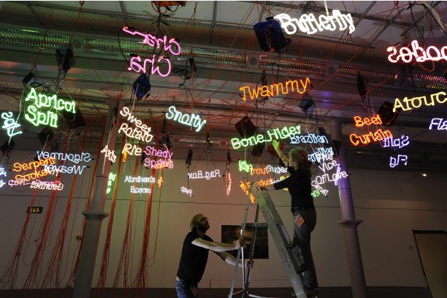
So we got in with 10% off the student ticket (don't ask me why, but not complaining!) and went into the first exhibition room which was on the ground floor. The room had giant, extravagant curtains on the entrance so I was quite excited to see what was inside. However, I was a bit disappointed. The first thing that catches your eye is Jason Rhoades' Tate Touche from My Madinah: in pursuit of my ermitage, which was created in 2004:


This installation basically consisted of a series of neon words hanging from the ceiling, along with lots of wires and cables. The range of words were really weird and wonderful; trout basket, Sigourney Weaver, apricot split and flapjacks were amongst the collection. Some of the words were perhaps not suitable for children so you immediately got the sense that this exhibition wasn't going to be the Disney/Tim Burton inspired adventure I'd expected. Nevertheless, I quite liked the piece - it was really colourful and crazy, just like Wonderland I suppose. The neon colours were really bright and bounced off the surrounding walls, it was a nice contrast to some of the other pieces in the room.
At the opposite end was a huge painting by Luc Tuymans called Wonderland (2007):


It was a beautiful piece but was very cold in colour and didn't really shout Alice in Wonderland - more the Snow Queen. Apparently it's based on the entrance to an Alice ride in Disneyland, but the colours are so stripped back I don't think anyone would recognise it.
There were also 3 really interesting photographs in the room by a Swiss artist called Annelies Strba, whose style is described as 'digital impressionism'. They are from a series called Nyima and feature girls lying asleep in woodland-type areas:


I really liked the effect of these pieces, the girls are glowing/radiating and they look quite magical. The colours achieved are really bright and bold, you can tell they are done digitally but that just adds to the appeal. Although the girls look really sweet and innocent, there's something slightly sinister about the photographs, are they really asleep??
After this first room we headed up to the fourth floor for the rest of the exhibition. Upon arriving I was quite surprised. The room was quite dark and was organised like any other exhibition, with pictures formally hanging all the way around the room with large chunks of text explaining the history of Alice in Wonderland. Some of this was fairly interesting, for instance I didn't know Lewis Carroll was actually a pseudonym for Charles Lutwidge Dodgson. The first part of this floor was dedicated to the early manuscripts of Alice in Wonderland which Carroll illustrated himself. We then get to the more recognisable illustrations of John Tenniel, when Carroll decided to use a more professional artist when the book was first published.


In a side room, more traditional pieces influenced by or depicting Alice in Wonderland were displayed. There were numerous cabinets with rows of books and illustrations which were mostly created in the late 19th and early 20th century. Below are just a few of the ones that I particularly liked:


Maria L Kirk, Alice Through the Looking-Glass, 1905.


Andre Jourcin, Alice in Wonderland, 1945.


Thomas Robinson, Alice in Wonderland, 1908.


Adrienne Segur, Alice in Wonderland, 1949.


Deloss McGraw, Alice in Wonderland, 2001.


Tove Jassonn, 1966.


Charles Handel Rand Marriott, Wonderland Quadrilles, artwork for piano sheet music, 1872.


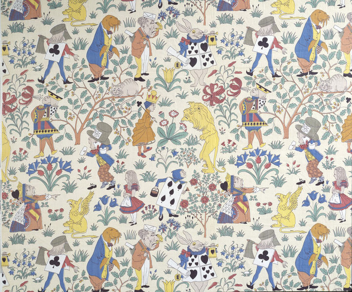
Charles Francis Amesley Voysey, Alice in Wonderland fabric, 1920.

At the end of this room there was also a collection of old and modern books that you could look at. One that caught all our eyes was a pop-up book by Jotto Seibold:


It was a really fun, clever book which was a modern take on the old story. I loved the typography and illustrations, it was such a quirky book and was completely different to the more traditional items in that room.
The next section in the exhibition was dedicated to Surrealism. Surrealists shared Carroll's fascination for the uncanny and unexpected. They were drawn towards Carroll's fantastical worlds, where normal laws didn't apply and a random set of rules existed.


Max Ernst, Alice in 1941, 1941.


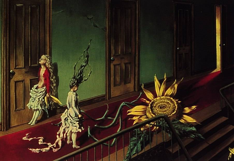
Dorothea Tanning, A Little Night Music, 1943.


Max Ernst, For Alice's Friends, 1957.


Max Ernst, Three Little Girls Set Out for the White Butterfly Hunt, 1958.

Towards the end of the Surrealist section were 12 illustrations which Salvador Dali had created. They were really mad and colourful - the combination of Dali and Alice was perfect. This is more of the type of thing I expected from the exhibition, he captured the essence of the story perfectly.

Mad Hatter Tea Party

Advice from a Caterpillar


Down the Rabbit Hole

In the final area of the exhibition, a section was dedicated to artwork from the 1960/70s. According to the information on display, the artists 'found a fruitful source of inspiration in the Alice books, particularly their depiction of a world freed from the conventional constraints of perception'.

Paul Laffoley, Alice Pleasance Liddell, 1968.


Peter Blake, Well This is Grand, 1970.


Adrian Piper, Alice Down the Rabbit Hole, 1966.

Adrian Piper, The Mad Hatter's Tea Party, 1966.


Adrian Piper, Alice and the Pack of Cards, 1966.


Graham Ovenden, Alice, 1970.


John Wesley, Falling Alice, 1963.

There were some interesting pieces in this bit, very colourful and psychedelic - just what I'd expect from that era. However, after this the exhibition went downhill. There were some movie clips, which as far as we could see had nothing to do with Alice, and to top it all off...a huge wall of pornographic text. I really thought this exhibition would be fun and interactive but it was completely the opposite. Alice in Wonderland was primarily a children's book but a lot of the exhibition was unsuitable for kids. I also didn't see one Disney drawing, which are really beautiful - I think there was a small section of the film played in a montage, but even this was hidden away in a little room. In my opinion, the exhibition was trying to be too clever and in doing so, lost the whole fun and essence of the story.