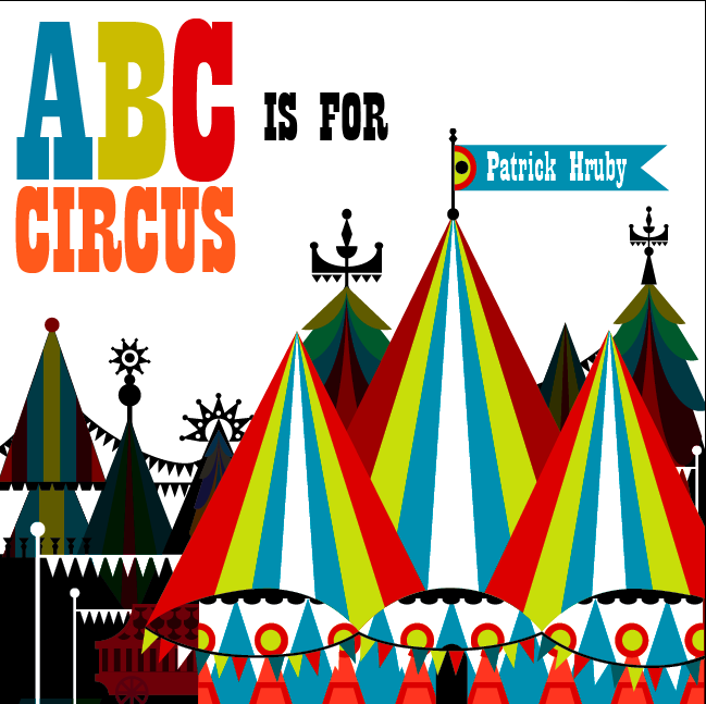
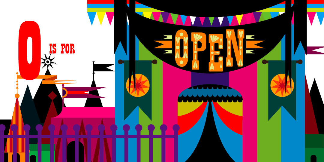
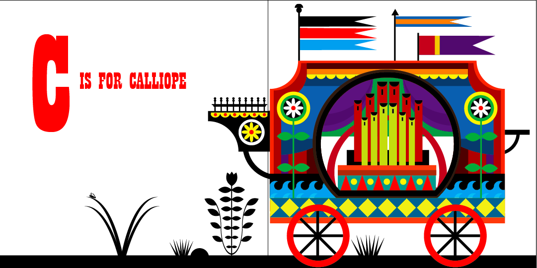
The first thing that strikes you, in these images, is the colour. Patrick has a brilliant eye and although some of the images are packed full of different colours, it never looks too much. He knows exactly when to stop and which colours work best together. I also like how he adds black to a lot of the images - it makes the bright colours pop out of the page even more and adds a certain amount of depth to the pieces. Colour is very important to me and I am hugely influenced by Patrick's ability to control the colour in his illustrations. Although I have experimented with colour, I would really like to create a piece where all the colours are 'touching' each other and not separated by black - it would be interesting to see how I would cope with this technique.
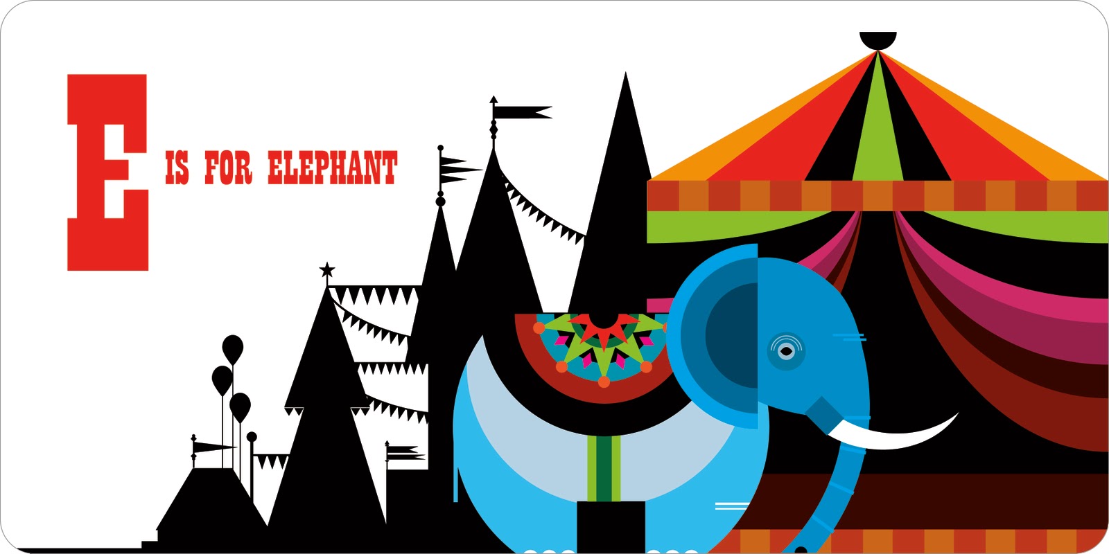
Patrick produces most of his work on Illustrator which allows him to create a smooth line to compliment the bold shapes and colours. The circus designs include a lot of intricate shapes which are often layered over each other. Although I can use Illustrator fairly well, I think the next step in improving my work is to produce more complex designs. I love how Patrick uses lots of simple shapes but builds them up in such a way that the finished result is very elaborate. This technique is definitely something I could use in my own work, in order to add another level of interest.

Patrick likes to create his own fonts and I really like the one he's used for the circus book. It's fairly simple but I like this as it doesn't draw attention away from the main illustrations. I dabbled in creating a font when I did my James and the Giant Peach cover and I thought it worked rather well. In the future, I liked to try and create a font which combines my love of colour with shape. On his website, there's an example of Patrick doing this really well, by overlapping simple shapes to produce a really quirky font.
One of the things that I love most about this book are the background elements. On various pages, Patrick has created a black silhouette of a circus scene to use as a background. As said before, I think the black makes the bright colours of the main image stand out even more. It also adds another layer of interest and creates a sense of depth. One of the most successful images that uses this idea is the 'daredevil' page. I love the detail of the silhouette - he has obviously spent just as long on that as the foreground image. In future work, I'd really like to experiment with combining colour and pattern with black - I think Patrick's use of this idea is very striking.

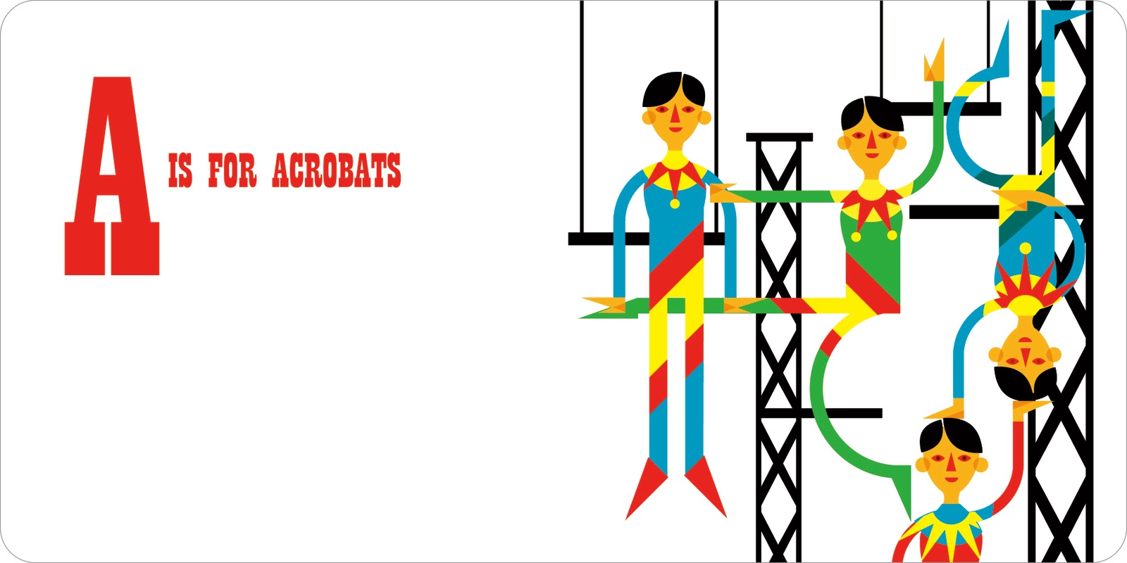
The main reason I love Patrick's work is because of his use of shape. When you zoom into one of his pieces, you see a series of simple shapes - but he builds them up into intricate patterns that become figures and elements. I particularly love the 'acrobats' page in the circus book, it's so wonderful and quirky. Two of the figure's legs are almost perfect circles and all of their hands are created from triangles. The sharp edges of the graphic shapes really compliment the vibrant colours, all of which makes the finished designs really bold and eye-catching. It's such a clever technique and combined with his use of colour and pattern, really sets him apart from other illustrators today. I love how you can see a clear connection between all of Patrick's work, right through to his typography, where he also uses simple shapes.
Although you can view a lot of the Circus book online, I've ordered a copy for myself! In 'real-life' I think the images will be even more stunning than they are on the computer screen. Patrick's use of colour, shape and technique make him my favourite illustrator today and I can't wait until the book arrives!

No comments:
Post a Comment