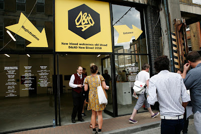
On Monday 28th June I travelled down to London to see D&AD New Blood, an exhibition for art students from all over the country. It was set in an amazing building called the Old Truman Brewery and despite the fact that it was boiling inside(!), there was a great atmosphere to the whole place!
There were so many different subjects on display but I thought the illustration work was particularly good, not that I'm biased or anything! The work was really impressive and there was such a huge range of different styles and ideas. All of the pieces were of a high standard and looked totally professional. It left me a little overwhelmed but also very inspired to achieve something just as good. I collected lots of business cards so I could take the time to look at various websites and blogs in detail. I love how all the rows of cards were like individual pieces of art, a lot of thought had obviously gone into them.
I liked lots of the student's work but I'll just mention a few who really caught my eye:
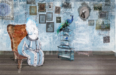
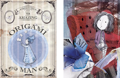
Emma Carpendale from University of Northampton had some beautiful work up. Her illustrations are very soft and sweet but also tend to have a slightly darker side to them. Looking at her website, she's uses an array of materials such as water-colours and collage to create her pieces. These combinations produce a really textured and interesting look.
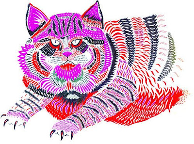
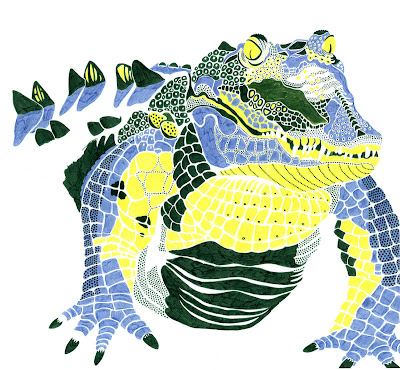
Margaux Carpentier from University for the Creative Arts Farnham (Graphic Communication) displayed some really interesting work. The animals he had created were really stunning; the way he broke them up into hundreds of different pieces was so clever. I love the almost fluorescent colours he used, it made them so eye catching and different to anything else there. I looked at his blog and he's applied this technique to lots of different animals, I think they look fantastic as a set.
I'm going on holiday for two weeks, but when I come back I'll post updates on my summer project!


