Monday, 11 April 2011

Jamie Brown

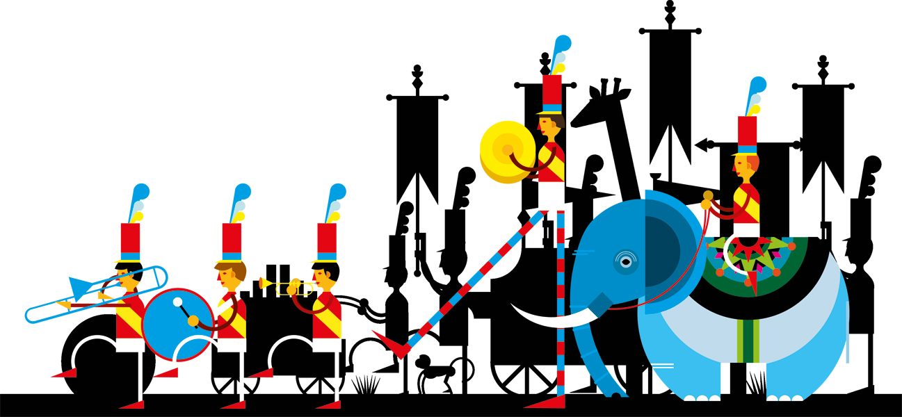
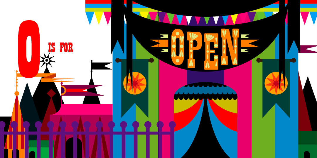
One of the briefs I'm working on at the moment is for a graphic design agency in Manchester called Music. Our task is to design a installation for a glass room in their studio. Ian gave us a presentation to give us some ideas for the project and one of the artists on it caught my eye straight away: Jamie Brown.
Jamie's illustrations are the sort of thing I envisage myself doing for this brief. His work is extremely bold and bright and full of different elements. I love the playful nature to his work - there are often little twists that you don't immediately notice. I really like how he uses fairly simple shapes to build up the image - this is something I will need to try and do if I'm going to use vinyl to create my design.
The song I've got in mind at the moment is "Lucy in the Sky with Diamonds' - which is a very psychedelic and has lots of brilliant imagery. In my head I see a really bold and colourful pattern covering the glass walls. I will definitely keep referring to Jamie's work to gain inspiration during this brief.


Thursday, 31 March 2011

Editorial Project

For the past two weeks I've been working on an editorial illustration for an article about parents not reading fairytales to their children. We had to choose an existing article to illustrate and this was where I encountered the biggest problem of the project! I found it really hard to choose an article - they're are millions of them all over the internet and I had real trouble narrowing it down. If I'm given something to work on, even if it's hard, I've got no option to change it so I just get on with it. But with this I kept wandering to articles that I liked but wouldn't particularly challenge me. I ended up choosing an article about fairytales and I wish I hadn't - I think I could have produced something much more interesting if I'd had a more difficult article.
Anywaaay...the illustration I produced is based on the idea that parents are shunning fairytales for less 'scary' stories such as The Very Hungry Caterpillar. In the image the caterpillar has become the scary one and is chasing off the fairytale characters. One of the challenges I faced was how to give well-known characters my own stamp. I created the image on Illustrator to give it a more modern look and I think it worked fairly well. The only character that perhaps doesn't work as well as the rest is Cinderella. Because of the Disney film, her look is so distinctive - so it was hard to make her my own.
I think the way I create figures has improved in this project, I particularly like Little Red Riding Hood and Hansel. The illustration sits well on the page and I like the strong purple in the background. I attempted to make the characters lift off the page by giving them shadows, but in subsequent work this could be pushed a lot further.
Overall I'm happy with the final design - I just wish I'd chosen a different article! (Sorry for the small images - not sure what's happening!)


Saturday, 26 March 2011

Arlene Adams

I came across Arlene Adams on the Print and Pattern blog and immediately fell in love with her work. She uses Illustrator to create her designs and I really like how she used simple shapes to build up a detailed illustration. She uses colour really well and her work often has a Scandinavian feel. I also like her use of symmetry - which is something I have tried to do in my work. I think it gives the detailed designs a bit of balance and helps them sit better on the page. Looking at her website, Arlene's work appears to have changed drastically in style - for the better! I will definitely be keeping my eye on her to see what she does next.


Thursday, 10 March 2011

Wellspring Project

For the Wellspring brief, the page I was allocated was titled "what is wellspring?". In the text I had been provided with, there were a lot of elements included such as 'schools', 'churches', 'food', 'toiletries' and 'clothing'. In the last brief for James and the Giant Peach I created elements that had featured in the book to form a pattern. As I had really enjoyed creating the book cover I decided to do a similar sort of thing with this brief. I thought about what I could encase the elements in and came up with four ideas: a hand, a dove, the wellspring building shape and a tin of soup. When I showed the compositions to the client, Jonathan Billings, he really liked the one in the shape of the building so that's the one I went with.


I created the elements in a similar way to JATGP - I found references for each component and then copied the basic shape in my sketchbook. I tried to use a minimal amount of lines and shapes as otherwise it would become too busy once all the elements were arranged in a pattern. Once I had finished the drawings I scanned them into Illustrator and traced them using the pen tool. As I find it really difficult to work in black and white, I decided to fill them in with colour and greyscale them later. After talking to Ian, I then removed the black outlines from the elements - they ended up looking a little less complicated and not so harsh.


I then thought about the composition of the pattern itself. Although I had used rows for JATGP, Ian and myself thought it would be better for this brief to try something different. I had recently come across an illustrator called Nicola Meiring whose work often involves elements arranged in a jigsaw style pattern. I really liked the effect of this, so set about trying to fit my elements together in the shape of the Wellspring building. It was actually quite fun attempting to fit everything together, for some reason I like fiddly things!

I decided just to use the outline of the building and not try to include the inside shapes like the windows and doors as I thought this would look too complicated. After a tutorial, I also inverted the text across the top of the building so it was sitting inside a shape. I think this gives a cleaner finish and doesn't attract attention away from the pattern.


I think the main strength of my design is the composition of the pattern. I think I've managed to get all the elements to fit together really well and nothing stands out as being out of place. I also think the elements themselves are fairly successful. There are a few in particular that I really like such as the shoe and toothpaste. However, I think ones such as the comb could be slightly improved. I really enjoyed this project and will definitely use the techniques I learnt in subsequent work.

Thursday, 3 March 2011

Patrick Hruby - Contact Report

I emailed the wonderful Patrick Hruby but I didn't really expect an answer as he's a very busy man! However....he replied! He was so lovely and gave me some really good answers. It made my day and I was astonished he wanted to look at my work! Anyway, here's his email:

Hello Philippa,

I am really touched that you would reach out to me. I would be happy to answer your questions.

I understand you are currently based in Los Angeles, does living there have an impact on your work?
Living in LA has definitely influenced my work. It is a land of perpetual summer. Ironically I prefer the winter, but there are definitely a lot of bright colors in this vibrant city, not to mention we have Disneyland (my parents used to take me every few years for my birthday.)

What are your inspirations? Do any artists/illustrators inspire you?
Strictly speaking my inspiration comes from the place where nature meets mathematics, but also I grew up on fairytales and I try to get to that place of wonder and magic. Idols of mine are Charley Harper, Alexander Girard, Mary Blair, and Kay Neilson.

Are you ever stuck for ideas? If so, how do you overcome this?
I get stuck for ideas all the time. But I have learned that a lot of times I am just afraid to try an idea that might seem crazy at first. I try not to edit myself in the beginning.

Would you be able to tell me about your working process? How do you get started on a brief?
Even though all of my work involves software (mostly Adobe Illustrator) I will start with a pencil. Sometimes I try to resolve the design before I resolve the concept. Sometimes the concept is revealed to me as I work out the general composition is strict geometry. When I get a brief I usually just take a bit of time to daydream and imagine what the finished project will look like. I think about colors and composition then I start brainstorming ideas. I make a lot of lists. I put them away and come back to them after I have had some time to see it with fresh eyes. I try not to resolve everything in the beginning so that there is still a little room for surprise.

What media do you use in your work?
Like I said before, all of my work (except my paintings) are somehow rooted in digital media. Depending on what the final outcome of the work will be, I will either deliver purely digital files, or I will silkscreen the designs into a physical object, scan it and send that.

Have you always loved using bright colours in your work?
I have always loved bright colors, but I wasn't always brave enough to use them. When I began my studies at Art Center College of Design I was painting watercolors which were much more ethereal. As I grew more confident in color and design my work began to become more and more direct.

I notice you have created several alphabets. Where does this love of typography stem from?
I have always loved typography. It was a bit of a mystery to me, and I am ashamed to say so, but I didn't take very many graphic design classes in school. I thought that type had so many rules that I just steered clear of it. Then one day I just decided to start making alphabets as best I could just to demystify it for me. That began a new love for me.

Is there any advice you would give to an aspiring illustrator?
The best advice I can give you is not to limit yourself by what you think an illustrator should or would do. Think of your work in every application you can imagine, don't be afraid to discover that you may be a completely different sort of artist that you imagined you would be. Above all, protect the quality of your work.

I hope that helped. I would love to see some of your work if you have a site or if you would like to send me some work.

Good luck in your studies!

Patrick



Saturday, 26 February 2011

Merijn Hos

I came across Merijn whilst flicking through a blog I had come across and was instantly struck by one of his pieces. Although his style is not at all similar to mine and it's something I will probably never aspire to do - I couldn't help being amazed by it. I looked on his website and there is so much stuff on it! His work is really diverse and he experiments with lots of different media. On one page there is a beautiful watercolour, on the next a colourful collage and on the next a gigantic installation. But what really caught my eye were his series of China ink drawings. The detail in them is astounding and the content is so playful. I love the use of pattern and although they are black and white you can tell they would be bright and dazzling if they were in colour. They're so quirky and fascinating I just had to put them on here for you to see!


Thursday, 17 February 2011

Nicola Meiring

Following on from the presentation by The Chase, I had a look around the internet at some of the design agencies they had mentioned. I was having a mooch around Folio's website when I came across Nicole Meiring's page. She is originally from South Africa but recently moved to England. Her work is really amazing and certain elements really remind me of my own work at the moment. Nicole obviously uses Illustrator to create her pieces and they have a clean graphic feel to them. In several of her designs she has used elements built up in a pattern to form a shape; which is what I'm trying to do with this current brief! I love the style of her work - there are clear influences from Scandinavian design and she has a passion for iconography. She has a great sense of colour and works with an array of tones and shades. Nicole has worked for a wide variety of clients and she is in frequent demand. Her work is really inspirational to me so it may be that I'll contact her to find out more about how she works.